Ardoq
Case Study
Ardoq is a software company that specializes in enterprise architecture and data management solutions. They provide a platform that helps organizations visualize, analyze, and manage complex business and IT systems.
The Problem to Solve
Ardoq's initial software product primarily catered to Enterprise Architecture specialists. However, the introduction of Ardoq Discover aimed to empower non-Enterprise Architecture specialists and teams – enabling them to make quicker, better-informed decisions and fostering democratized decision-making, engagement, and collaboration with other stakeholders.
With the goal of providing real-time, contextual insights to everyone in the organization, Ardoq Discover strives to deliver a seamless and enjoyable user experience.
The challenge was to design a landing page for Ardoq Discover that considers the needs and workflows of non-specialist roles while also supporting the efforts of Enterprise Architecture specialists.
Information Provided by Ardoq
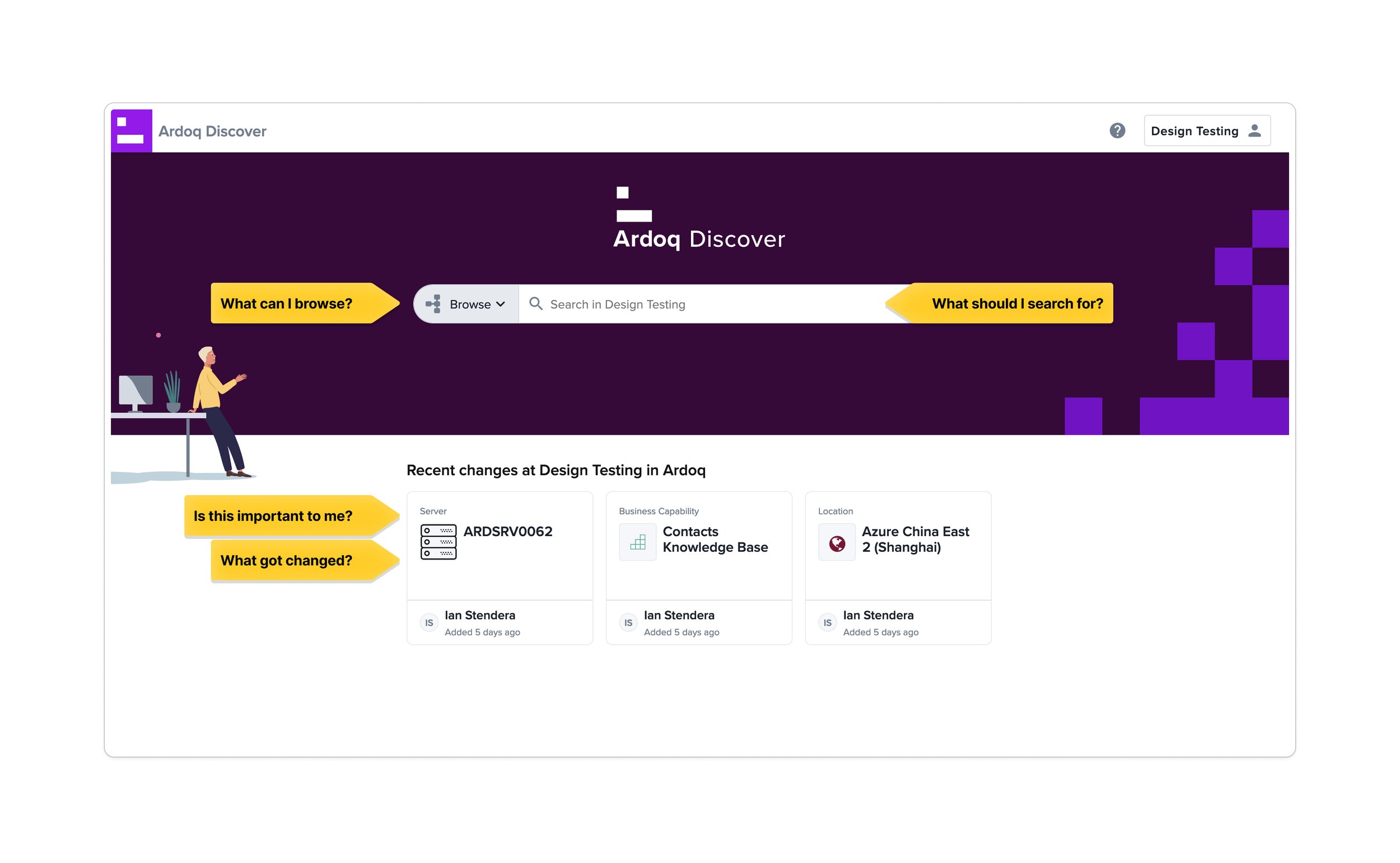
The image below is Ardoq Discover’s current landing page.

The image below, provided by Ardoq, shows the path that users take to get to the Details Page.
Users either search for the information they are looking for or use the short cuts in the “Recent Changes” section located below the search bar.
The metrics, provided by Ardoq, also show that in Step 1, about 46% of users search, while about 38% of users go directly to the Details page via the “Recently updated” section. But it was unclear if search is dominant because users want to search or it is only one of two options they are presented.

I started by looking at Ardoq Discover’s landing page and found a few initial problems. As a new user, regardless of experience, you might look at the page below and think:
What can I do here?
What can I browse?
What should I search for?
I see there is a “recent changes” section, is this relevant/important to me? For example, if I was not related to the IT department: I see that Server ARDSRV0062 was changed. OK, but how is that relevant to me?
Even if I was in the IT department and that server was critical to my operations, I still don’t know if the change is important to me because it doesn’t give me more information at a glance. What changed? Did the server break? Did it get upgraded? Did it move locations?
Clicking on “browse” opens a modal where I can view categories. The categories work exactly like a folder system on your computer where you can have a folder with sub folders inside of it. For example, you could have a folder for your vacation photos, sorted by year, then location, then dates.
As seen below in the image provided by Ardoq, clicking on browse opens a modal with categories.

I decided to explore the Business Capabilities category.

Once I click open, it redirects me to the Details page. Unfortunately, if this was not the page I was looking for and I press back in the browser, it takes me back to the main landing page instead of the modal. Forcing me to start the navigation all over again.

Thinking of improvements and solutions
I began by contemplating the user's path to reaching the landing page of Ardoq Discover, by creating a simple customer journey.
By the time a user purchases Ardoq Discover, Ardoq is already well-informed about their expertise level, wants/needs, company size, company type, and more.
Utilizing this information, Ardoq can personalize the landing page by providing support documentation, tutorial videos, and a basic setup experience.

I brainstormed with basic sketches, thinking about layout, spacing, and grids.

With sketches done, I transferred ideas to Figma.
The Updated section now shows more information about what changed with longer titles and notes.
There are search suggestions for new comers. For example, if an Admin added a new user, the Admin could set search suggestion.
There is support documentation that is easy to find as well as a feature to “pin” items which works similar to bookmarks.

I experimented with an alternative layout, but found it unsatisfactory as it still hid the Browse function, much like the existing design. I waned the categories hidden behind Browse to be immediately visible so that users knew what they were and what where they could go.

After iterating on numerous designs, the layout below is what I explored further. It displays all categories clearly with the ability to scroll if the list grows longer. There is plenty of space horizontally in case more information is added.

Next, I explored how to display subcategoies. In my design below, I introduced distinct approaches for searching across all of Ardoq via the top rectangular search bar, or within a specific category using the pill-shaped search bar. The intention behind this differentiation was to provide users with more relevant search results. To illustrate, consider the analogy of searching for "Mexico" within your photos folder, where the results would predominantly include your vacation photos. Conversely, a system-wide search for "Mexico" might yield vacation photos alongside research documents containing the word "Mexico," which may not be relevant in that specific context.
On the left-hand side of my design, the parent category, such as "Business Capability," is displayed along with its corresponding children in a drop-down menu.
Clicking on "Core Capabilities" within the parent category of "Business Capabilities" reveals the subcategories on the right-hand side. Additionally, breadcrumbs help users maintain awareness of their location. The far-right section presents all the primary titles of the subcategories, enabling users to quickly assess whether they are in the correct place without the need for scrolling or navigation. These titles are also clickable, facilitating direct navigation to the desired section.

The problem with the design above is
Core Capabilities has a subcategory of
Contact Center, which has a subcategory of
Contact Center Design, which has a subcategory of
Conact Center Set Up.
However, if there are more subcategories beyond this point, continuously reducing the text size becomes impractical. Although displaying all the subcategories in this manner can be helpful, it may not be entirely necessary.
For example, below, it shows the Details page of Contact Center Setup. All the supercategories of Contact Center Setup are still accessible from this page.

So a design where you only display the main subcategories with a description of the subcategories is possible. A “Load More” or “Go to subcategories” option can still display the full list if the user wishes.

Or maybe a side panel that slides out.

I also explored the idea of using ChatGPT. As of June 2023, ChatGPT is incredibly popular. I thought of a design where you could ask for the Details page you’re looking for. For example, if you wanted to see office locations in EMEA, it could be under the category of “Locations” or “People and Organizations”. Instead of having to go hunt, it would be great if you could simply ask and get the Details page you want.


Proposal
Ardoq liked the idea of clearly displaying categories that users can browse with an option to go to subcategories.
My solution helps both new and advanced users by clearly displaying categories instead of hiding them behind a menu. This helps users navigate and understand where they are.
The search bar is still prominent at the top of the screen, allowing users to quickly search if that’s what they prefer.
The ability for an Admin to customize the home page also helps both new and advanced users get accustomed to Ardoq Discover. Admins can display relevant information to their users and even pin/share items that are important.
The navigation bar on the right hand side of the screen also helps users quickly see if they are in the right area. This eliminates unnecessary time scrolling around sections.
Sub categories will also load in a dedicated new tab, reducing clutter from the main navigation.

