Gramo

Gramo is a Norwegian company dedicated to tracking music and royalty distribution. Gramo tracks music that is played on radio stations, cafes, shops, etc and collects royalties on behalf of rights holders. The money is then distributed to artists and record companies.
I was the lead UI UX designer for Gramo. I was in charge of conducting user research, interviews, design, and testing to discover areas of improvement. Most recently, I worked on the administrative aspect of the software to more efficiently keep records and accurately distribute royalty payouts. My research unveiled areas for automation and streamlining processes to help speed up workflow. I worked closely with devs to ensure my designs were feasible; I worked with the PM for scheduling; and the clients to deliver the correct solutions. My designs have decreased the time it takes to identify a song and update its records. Below is a sample of the work I’ve done.
Gramo uses their internal software, Echo, to manage data and distribute royalties. I was asked to see if the process of data administration could be made more efficient.
Process
I began the process by conducting interviews with Echo admins, aiming to gain insight into their roles and daily responsibilities. After conducting initial interviews to understand their general work day and common problems, I began to understand that admin spent a majority of their day in a section of the app designated to "Unidentifiable Tracks." This section kept record of tracks that had been radio broadcasted but remained unidentifiable by Gramo's internal database. These tracks were unidentifiable for multiple reasons, such as
Obscure tracks
Variation of spellings
Misattributed artists
Translated titles
Incorrect ISRC (International Standard Recording Code - a unique serial numbers assigned to tracks)
Brand new tracks that do not exist in Gramo's database yet.
I went further to understand the specifics. In addition to interviews, I researched by shadowing Echo admin while they went through the process of identifying “Unidentifiable Tracks”. It quickly became clear that admin were doing mundane, repetitive tasks on a daily basis which consumed a lot of time and caused frustration.
Admin had to manually check each unidentifiable track to determine if it existed in their database. If the track existed in the database, it was a relatively straightforward process of referencing the unidentified track to a track in Echo’s database. This let the system know that the track has been identified and that royalties should be distributed accordingly.
On the other hand, if the track was absent, the laborious, manual process of adding the track to the database ensued. Administrators meticulously and manually cross-referenced multiple sources, including platforms such as Spotify, Discogs, and VRDB to certify details such as artist name, track duration, release date, ISRC, labels, catalog numbers, producers, etc. were correct of the unidentified track.
They would then copy or type this information into Echo’s database. It was a time-consuming, arduous process, but for good reason – admin wanted to make sure royalties from each track were going to their rightful recipients.
To make matters worse, the structure of Echo's application forced users to go through a maze of pages to complete simple task such as adding an release (album) title, adding performers, or other tracks within a release (album). While this might have been tolerable for occasional use, Echo admin were performing these tasks everyday. The time lost to navigating between different sections within Echo was diminishing productivity and causing frustration among users. This became the focal point of my research.
Research Process
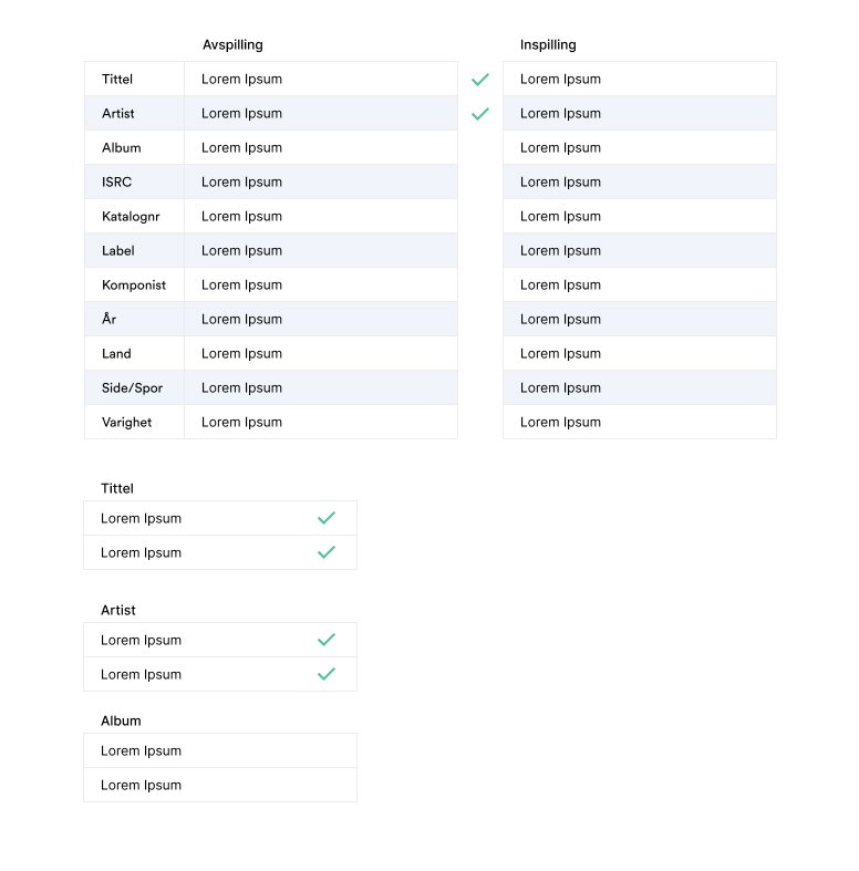
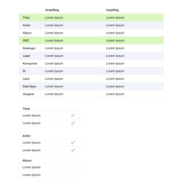
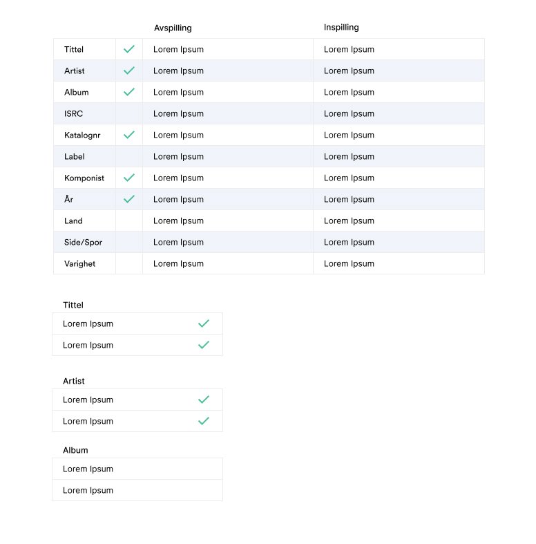
To give you an idea of my process, here are some of the work flows that I observed during my shadowing which I recorded several of and rewatched for analysis. I began by understanding the overview of their process.

I then mapped out a more detailed view of the flow. These were important for me to understand and get correct so that I could use as a foundation for the rest of the project.

Identified frustrations
From my interviews and shadowing here were the main patterns I found:
There are too many steps to do simple tasks such as adding supporting artists to a track.
These simple tasks often require jumping to different sections of the app, even though they are all related.
Lots of copying/pasting of the same information to different parts of the app.
Not a frustration, but a discovery - Although a variety of sources are used to verify a track, Spotify is used as a main source of truth for track/album information.
My goal was to see how these frustration could be eased for the user.
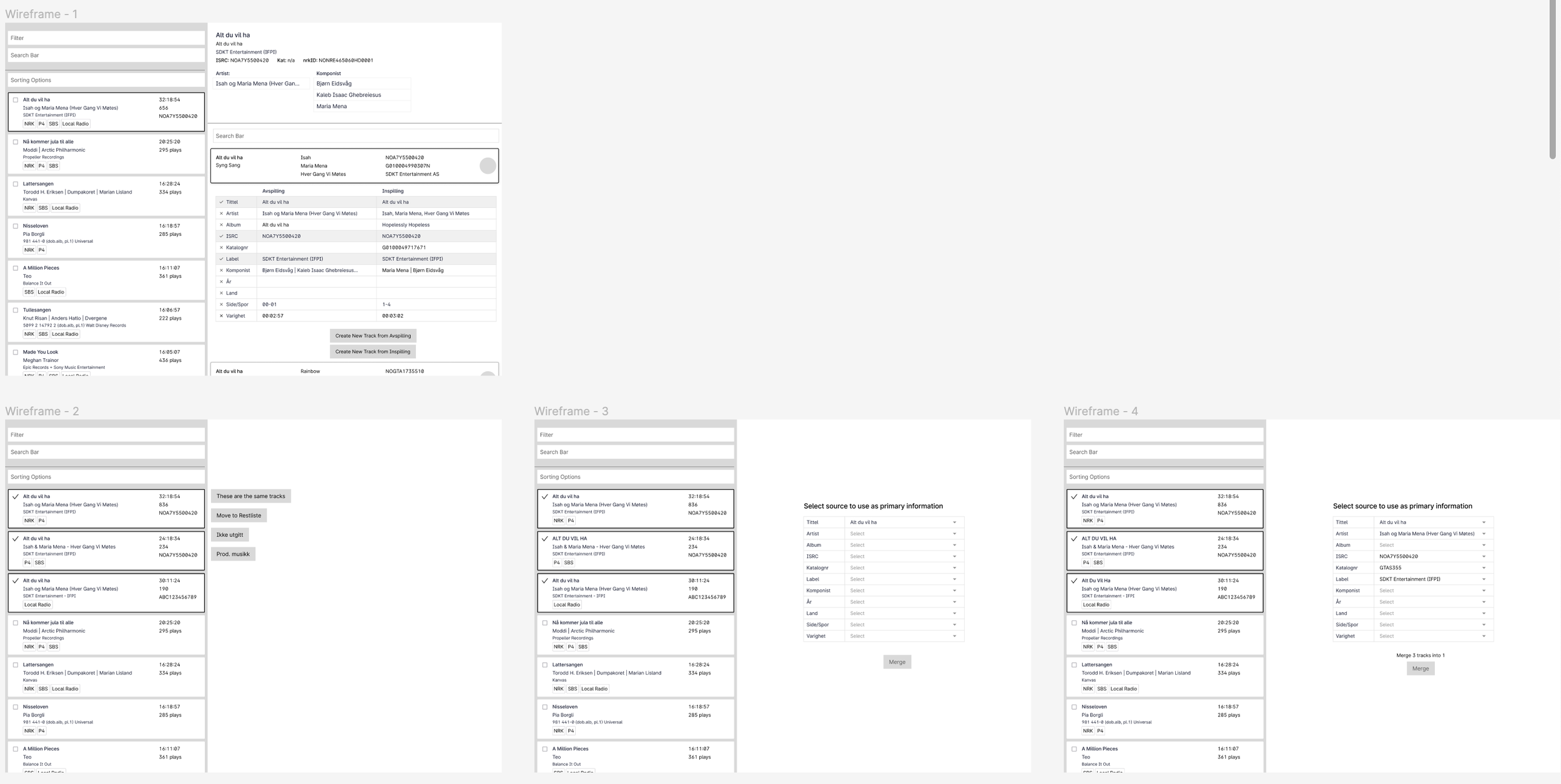
Improvement: Re-organize Unidentified Tracks
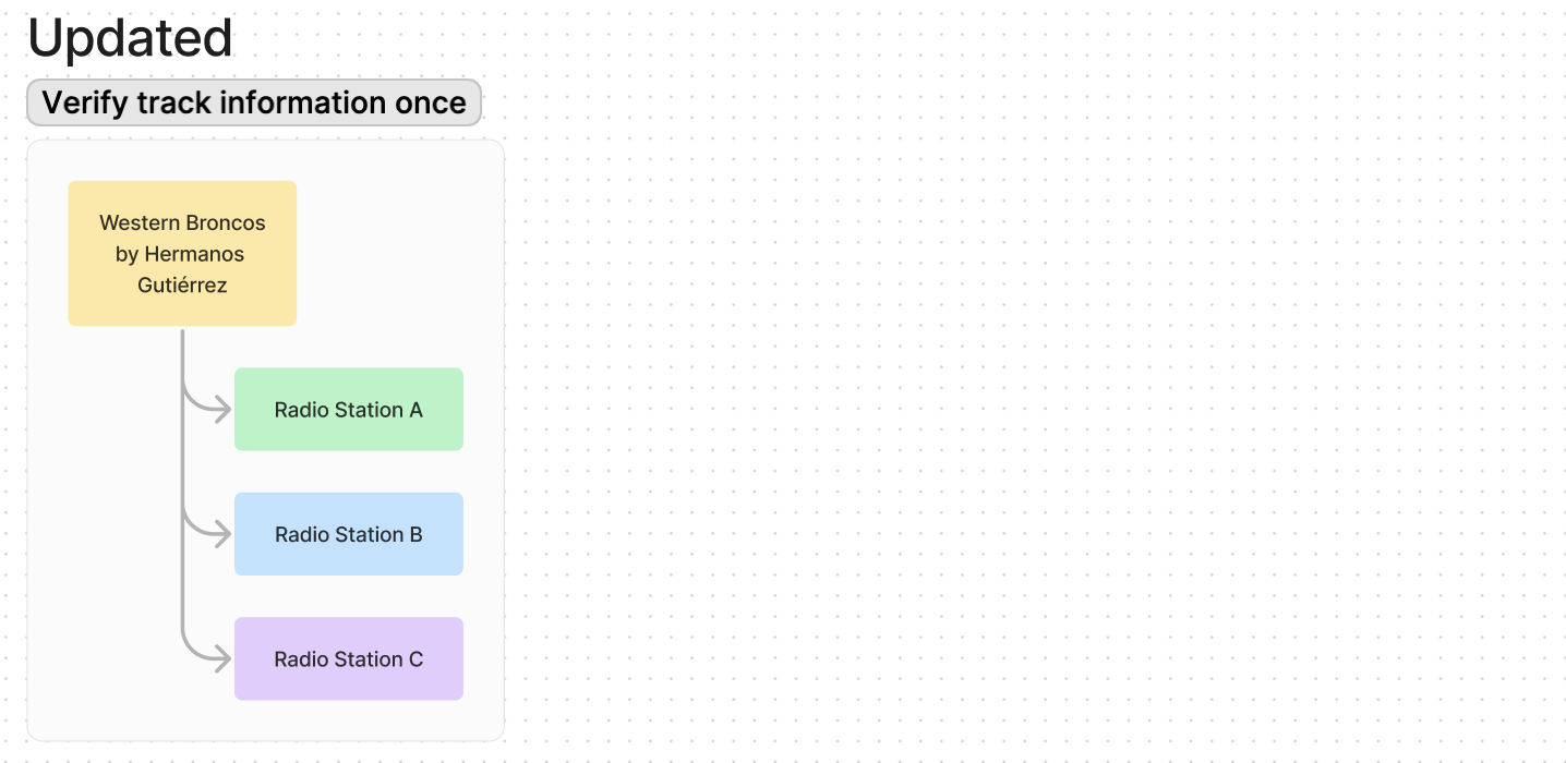
The previous method required repetitive verification of identical tracks each time they were broadcast on different radio stations. In the example below, "Western Broncos" by Hermanos Gutiérrez, was played on Radio Station A, B, and C.
In the former system, Echo administrators verified the same track three times for the different radio stations - despite it being the same, exact song across three stations. This was because the radio station was the parent and the track was the child. This was adding unnecessary, repetitive work for admin.

In the improvement, Echo administrators only needed to verify the track once because in the backend, the track became the parent and the radio stations the children. Once a track is verified, the information updates across all stations which played the track. While this involved UI changes, it also required work by the devs. I worked with the devs to make sure implementing this change in the parent/child relationship fit within their budget and collaborated on timelines.
Improvement: Use Spotify API to import most data
Even though Echo admin checked with a variety of sources when verifying information, I noticed they relied heavily on Spotify for information when it came time to input data into Echo. Previously, whenever a song required verification and was present on Spotify, Echo admin would copy/paste as much data as possible from Spotify. Although Echo already automated some data importation from Spotify, such as artist, song duration, and track title – I discovered there was a lot more that could be automated by reading the Spotify API documentation.
Already automatically imported:
✅ ISRC
✅ Main artist
✅ Track Title
✅ Duration
Additional info that can be imported:
Label
P-line
Country of release
Date of release
Along with track information, release (album) information could also be imported from Spotify.
Release title
Tracks on release + relevant information mentioned above
Genre
C-line
The most important piece of data out of this list is the ISRC - a unique identifying number for each track. With an ISRC, information can be either directly imported or deduced from related information. From observations, this was also the data point users relied on to import data. It was also always the first form field they completed (even though it was the 5th field down on the screen in the previous system.)
✅ Indicates information that was automatically imported previously
⭐️ Indicates information that is automatically imported with update
🛑 Indicates information that must always be manually entered because API is not available
Below is a tree I created showing relationship of data to ISRC.
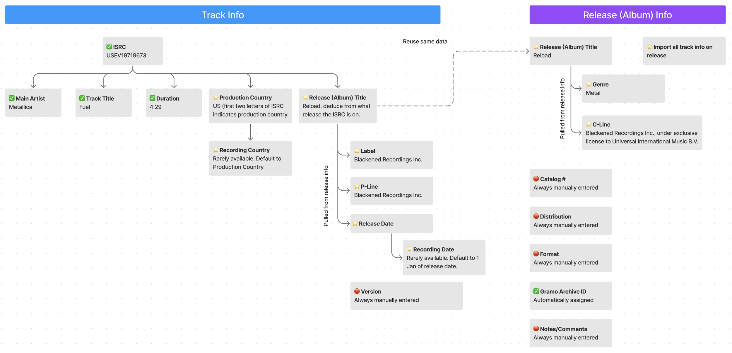
Tree showing relationship of data to ISRC.
By directly importing data from Spotify API as well as automatically looking up and importing related data, 11 additional data points can be automatically filled for the user.
I worked with devs to make sure that not only could the API be used, but that we could use it without upsetting Spotify’s terms and condition since we would have to ping their servers multiple times a the day, five days a week. Luckily our usage of their API did not break their Ts&Cs and we could successfully implement this.
Improvement: General UI/UX clean up
The UI was contributing to inefficiency. For example, users would have to hunt for the ISRC field. Even though it was the first form field they always filled, it was the 5th field down. Additionally, several other issues were apparent such as misaligned fields and inconsistent component sizes. The poor UI negatively impacted overall UX because the UI was inconsistent and unpredictable. Thus, a general UI cleanup was also in order.
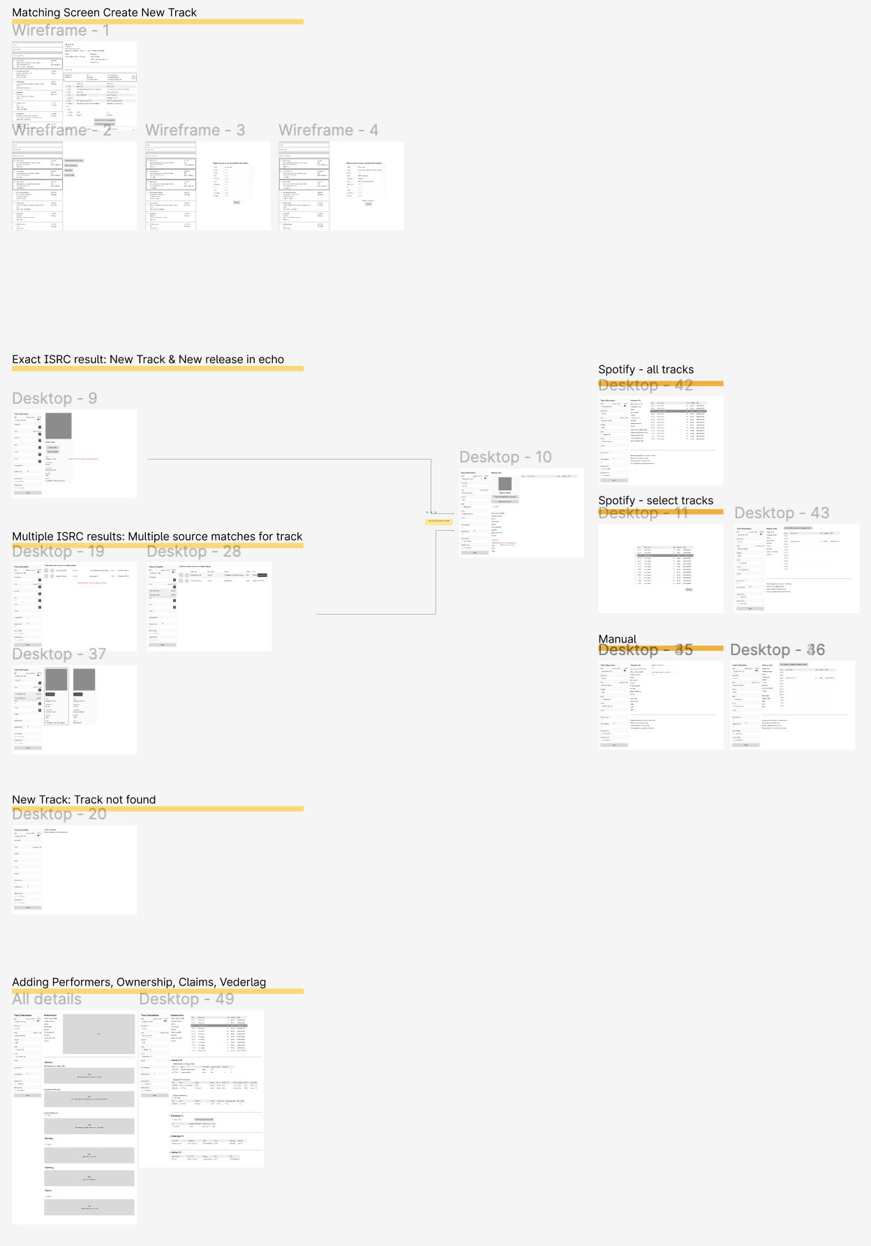
Old Designs
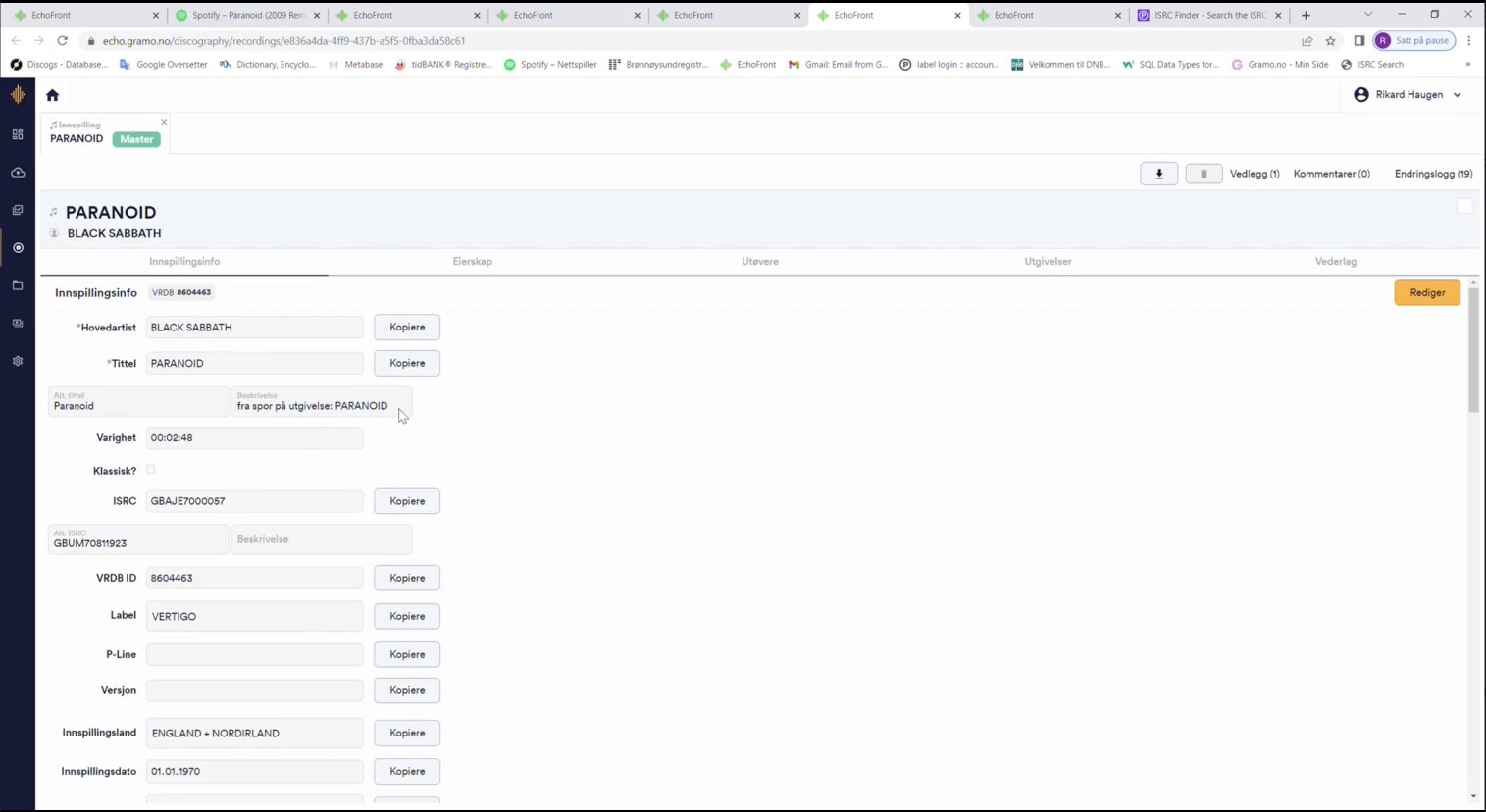
Examples of low fidelity and flow designs (click to enlarge)
Designs were continually presented and discussed with the devs, PM, and clients throughout the process.
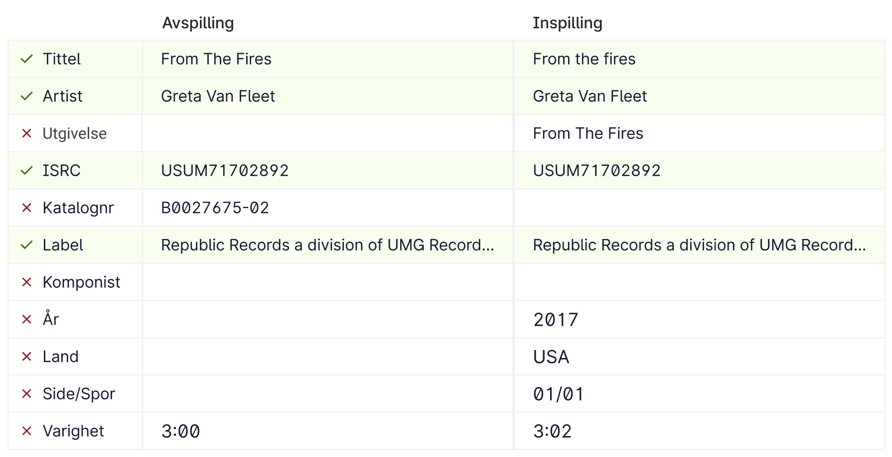
Testing Table Designs
Tables became a focal point of my design since that’s how users compared and scanned data for Unidentified Tracks. I wanted to design something that reduced cognitive load/eye strain and yet make it very obvious at a glance if data was correct or incorrect.
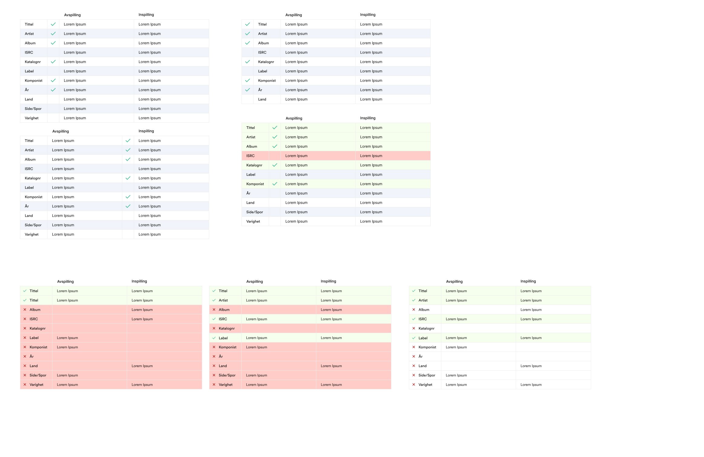
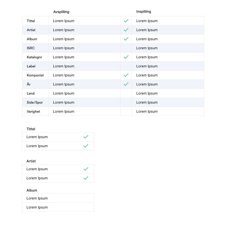
After some testing with Echo admin, the design below was the winner. By only scanning the first column, it’s obvious at a glance what is correct or not. This type of missing data is typical in Gramo where some rows match, some have missing information, or no information at all.
Extra: Updating the font
While updating the font was not on my radar to fix, it occurred to me that it might be helpful.
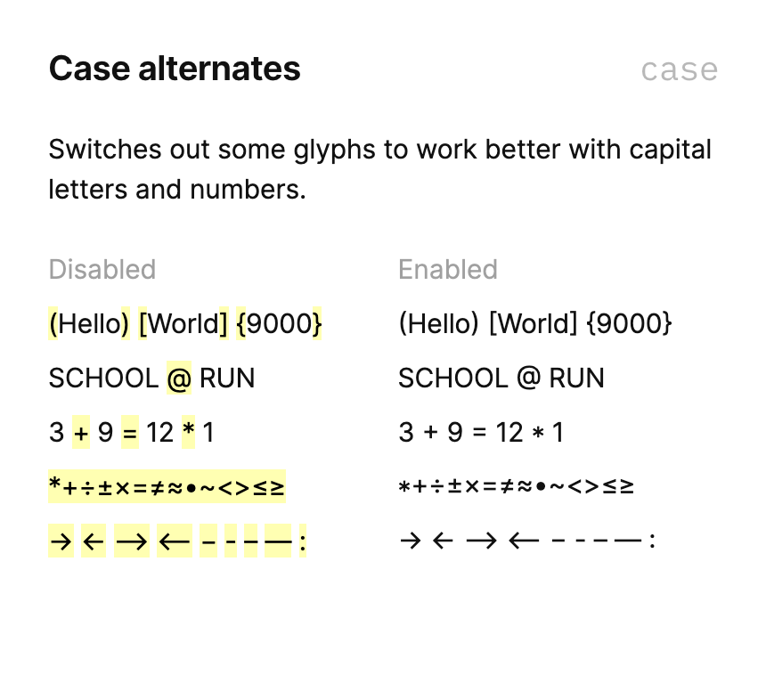
Everyday, Echo admins scan, read, compare, and copy/paste textual and numerical data. The “Circular XX” font, which Echo had been using, was disadvantageous for tasks involving data scanning and entry. This was because of the font’s rounded shapes. I made the decision to do an A/B test with a font named “Inter.”
Inter has great features that Circular does not, such as tabular numbers, case alternates, and greater visual difference between similar looking characters. All useful features when comparing things such as serial numbers, codes, payouts, and names.
After an A/B test with Echo admins, where everything but the font remained the same, it was evident that users preferred “Inter” over “Circular XX” as it improved data scanning, improved data entry, and reduced eye strain.


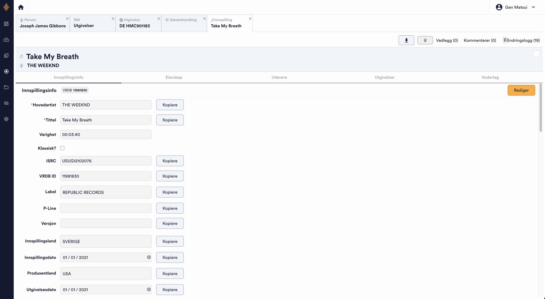
Samples of Final designs
My research unveiled areas for automation and streamlined processes to improve workflow, user experience, and accuracy. I worked closely with the dev team to ensure my solutions and designs were feasible and fit within the team’s and client’s budget. My designs have decreased the time it takes to identify a song and update its records by up to 10%. Below are samples of the final design work I’ve done.
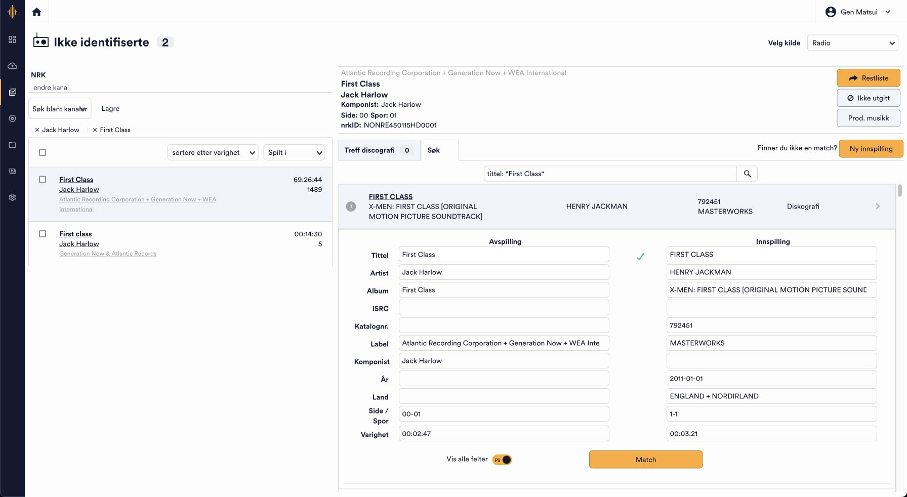
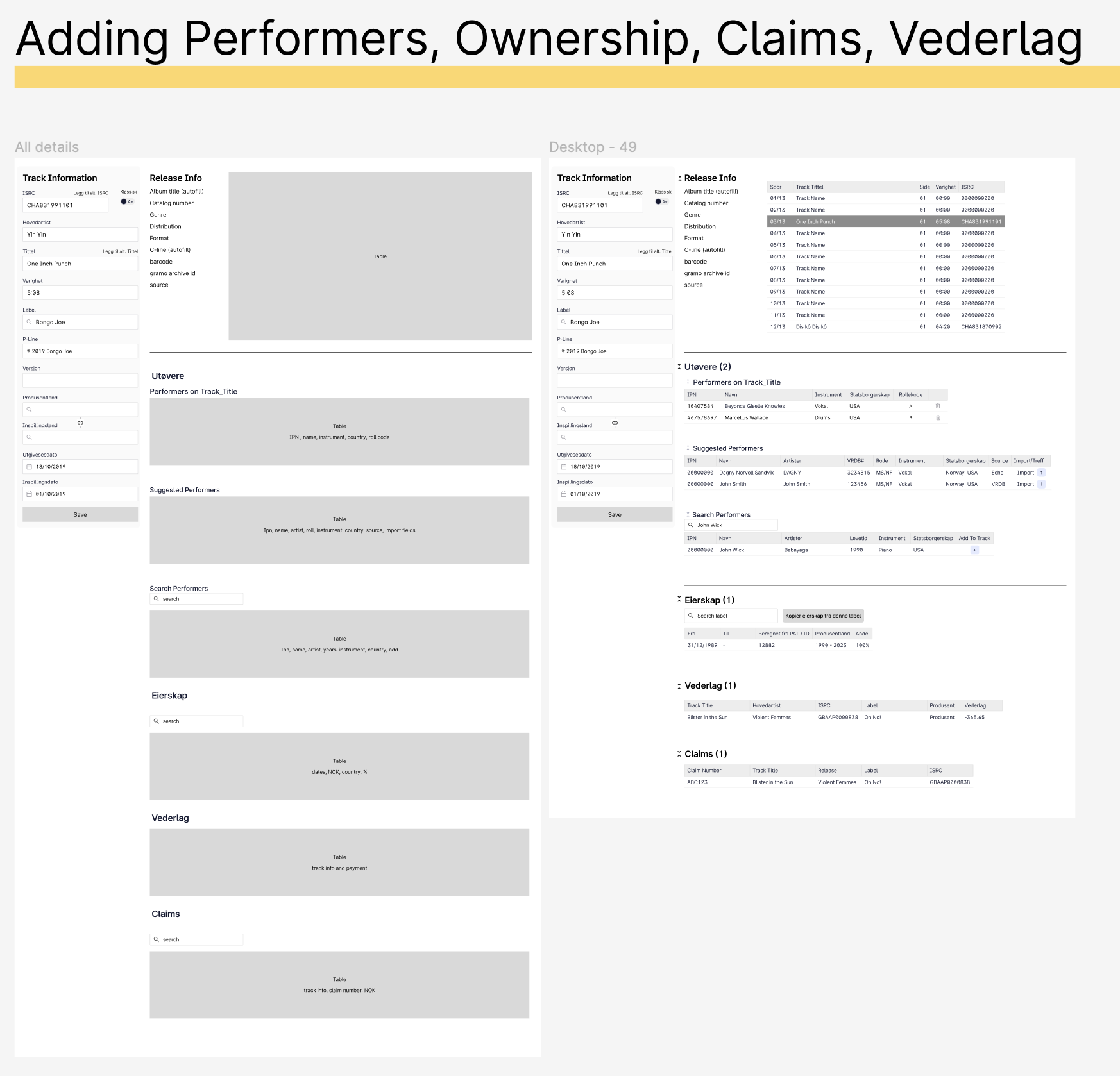
The screen below is the main screen for “Unidentified Tracks”. On the left panel, you have a list of tracks that must be identified. With the right panel showing details of the track that is selected.
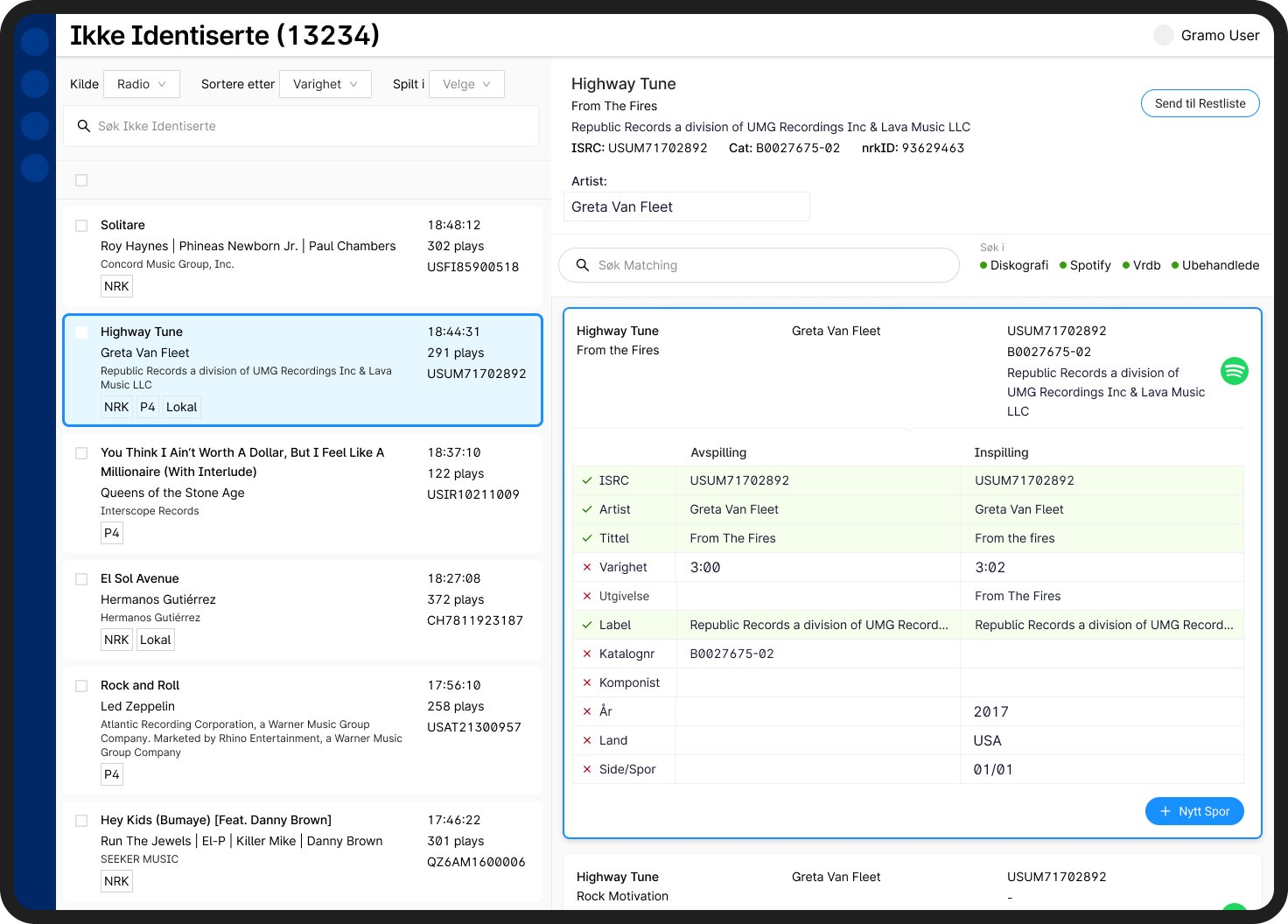
The general layout of the application was largely kept from the previous design. Users liked being able to see the list of unidentified tracks because they treated it like a ticket system. It also allowed them to search for related tracks in the left panel while keeping the track they are working on visible.
In the example above, the user is working on a track named “Highway Tune” and has the details open on the right panel. While they have the details open, users like to search for identical track names, artist names, label names, etc. because it often served as a first step of verifying and cross referencing details.
In the left panel, the track title, artist name, label, total duration of play time, how many plays, and ISRC number are displayed. The tracks are also the parent now, so the radio stations show up as tags. For example, “Highway Tune” was played on NRK, P4, Lokal radio stations. The layout of this information was kept the same because users were already used to scanning information in this format. On the other hand, I removed the persistent underlines from the old designs which indicated items could be clicked.
While it was helpful to project something could be clicked on, when rows and rows of items were underlined, it added to cognitive load when users were trying to compare data. In the new design, underlines only appear when users hovered over line items. At first, users were a bit surprised the underlines were gone, because they thought they couldn’t click on the items anymore, but they were reassured once they hovered on items and the underlines appeared. They could still click on them to quickly search for that information as before.
New format

Old Format

During observation, users would also copy ISRC, Catalog # (cat), and nrkID frequently to cross reference information with other external sources. These external resources are crucial to the admin’s work and cannot be integrated or eliminated. Thus, I wanted to make it easier for the admin to identify and copy this information. Hovering over this information will bring up a copy button so that users do not have to highlight, saving a few seconds.
Below, if a new track is added to the database, the user can do so by looking up the ISRC number and importing data from suggestions sourced from Spotify. Previously, all data had to be inputted manually. Album cover, Album Title, ISRC Number, Artist, Track Title, and Duration is clearly displayed so information can be compared and contrasted. Information is displayed horizontally in the order that users determined was easiest to interpret.
All relevant information is automatically imported once the user chooses a source.

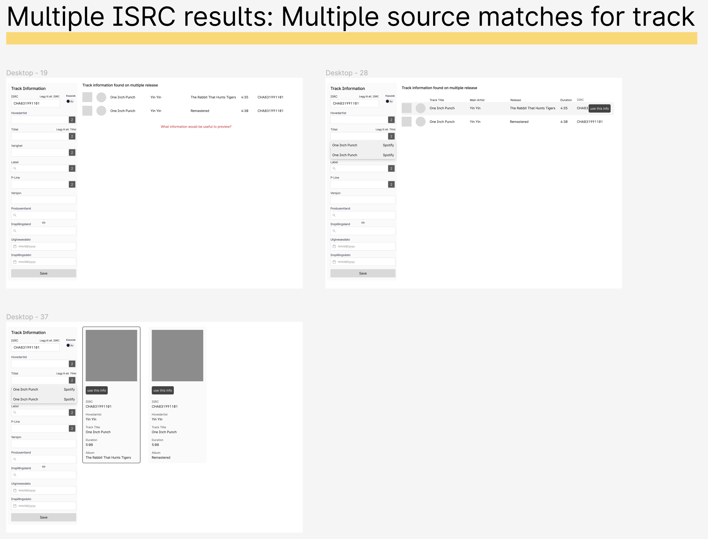
On the left hand panel, the number in the blue squares represent the number of results for each form field. For example, varighet/duration has 2, because the track is either 8:34 or 8:35 long depending on the source. If users wish to pick and choose information from different sources, they can do so by clicking on the blue squares.
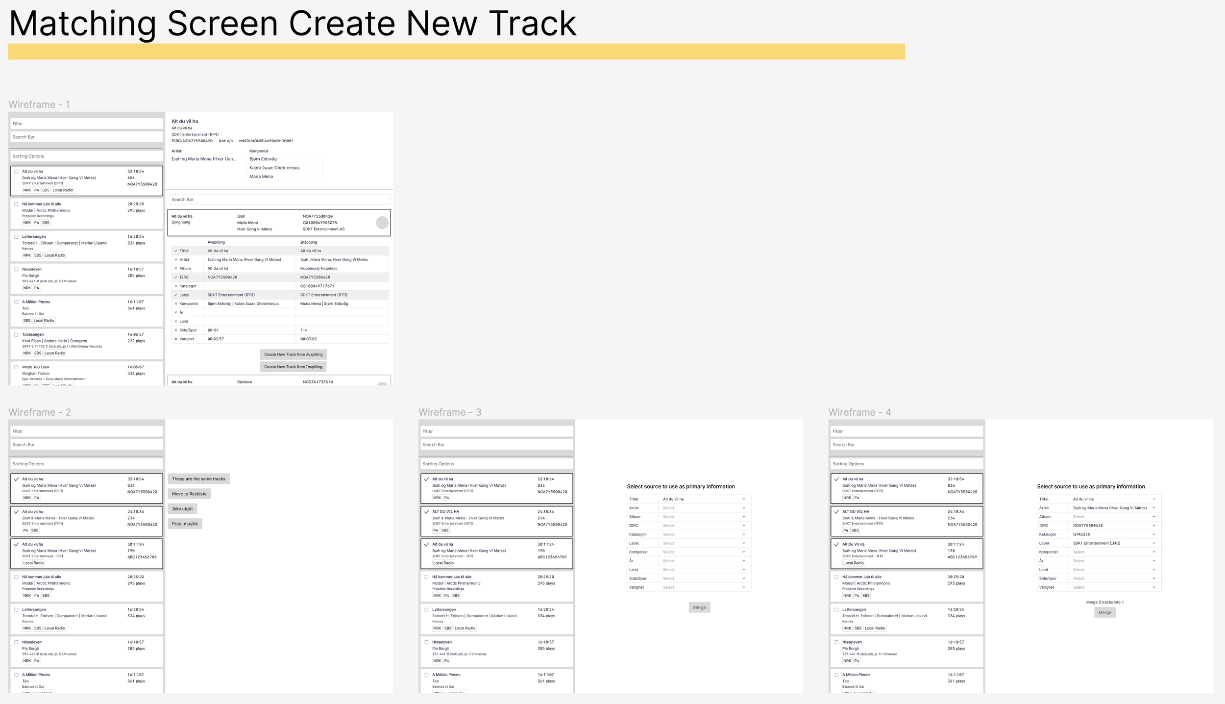
Below, once the track information is completed, all tracks on an album are also automatically imported. Research showed users liked to import all related tracks into the database. It’s common if one track on a release is played, so are others. Importing all track information makes identifying songs easier in the future.
Editing/viewing performers (utøvere), ownership (eierskap), remuneration (vederlag), and claim number is consolidated on this screen to minimize the need to jump to different section of the app.
Another time saving improvement was adding role codes under the performer/utøvere section.
You’ll see a section named Rollekode (role code) and Rolle (role). Both refer to the exact same thing, but have different names because the information is being pulled from different sources. You’ll also notice one uses a code like A and B, and the other uses a four character alphabet code divided by a slash, such as MS/NF. Again, both refer to the the same thing, but are formatted differently due to the different sources. Imagine the word for “dog” and 🐶 emoji, it’s the same thing, just formatted differently.
Previously the user had to “translate” these role codes manually, so for example, MS/NF would be translated to A. In the updated design, this would automatically be done for the user in the backend. This reduces the necessity for the user to recall what the “translations” are, and also avoid mistakes if they remember incorrectly.

Conclusion
This was a great project where I got the opportunity to learn a complex process of paying royalties to performers and artists. I learned the “why” behind certain things from dev perspectives and user perspectives. Such as why role codes are so convoluted, when I thought it would be simple to consolidate them, or that changing the parent/child relationship between track and radio is a simple task, when I thought it would be hard.
It was a joy to see things go from initial research, brainstorming, collaboration with different teams, designs, testing, to launch. I look forward to receiving more feedback on my designs to so that I can evolve designs and features to help users do their jobs more accurately and efficiently.