Ardoq
Case Study
Ardoq is a software company that specializes in enterprise architecture and data management solutions. They provide a platform that helps organizations visualize, analyze, and manage complex business and IT systems.
The Problem to Solve
Ardoq’s original software product served mainly Enterprise Architecture specialists. The new product, Ardoq Discover, aims to empower teams and non-specialist users to make faster, better-informed decisions. It is designed to foster democratized decision-making, engagement, and collaboration across all stakeholders.
The goal was to design a landing page for Ardoq Discover that accommodates the workflows and needs of non-specialist users — while still supporting expert Enterprise Architecture practitioners.
Information Provided by Ardoq
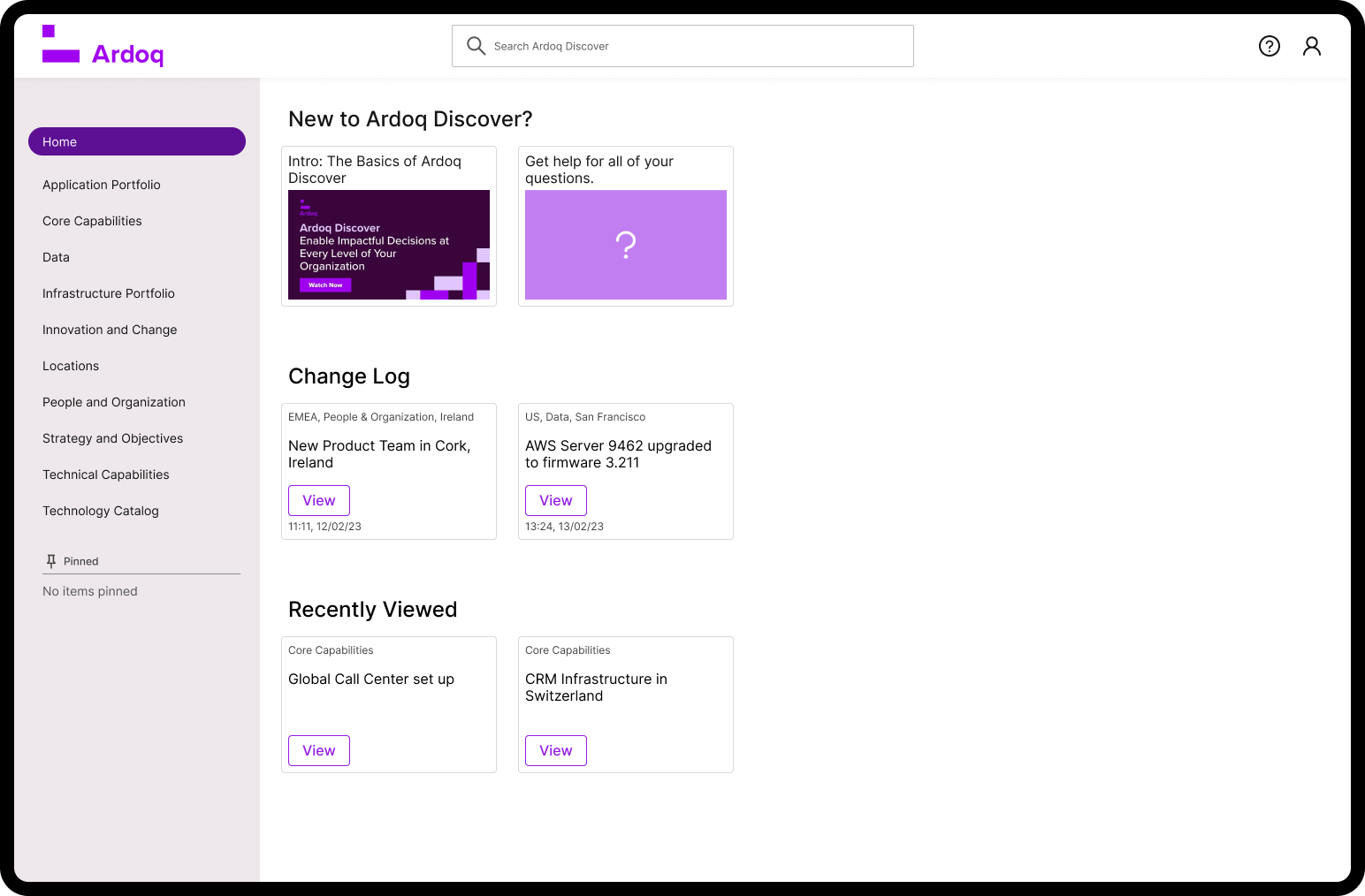
Below is the existing landing page for Ardoq Discover.

Images provided by Ardoq show the user path to the Details page. Users either search for the information they need or click a shortcut in the “Recent Changes” section below the search bar.
Metrics from Ardoq indicate that in Step 1, about 46% of users search, while about 38% of users go straight to the Details page via “Recent Changes.” What wasn’t clear is whether search is dominant because users prefer it — or simply because it is one of the two options available.

Initial observations
When I reviewed Ardoq Discover’s landing page, I noted several points of confusion. As a new user (regardless of technical experience), you might ask:
What can I do here?
What can I browse?
What should I search for?
Is the “Recent Changes” section relevant or important to me? For example: If I’m not in the IT department, I see “Server ARDSRV0062 was changed” — ok, but how is that relevant?
Even if I am in IT and that server is important: What changed? Did it break, get upgraded, or move?
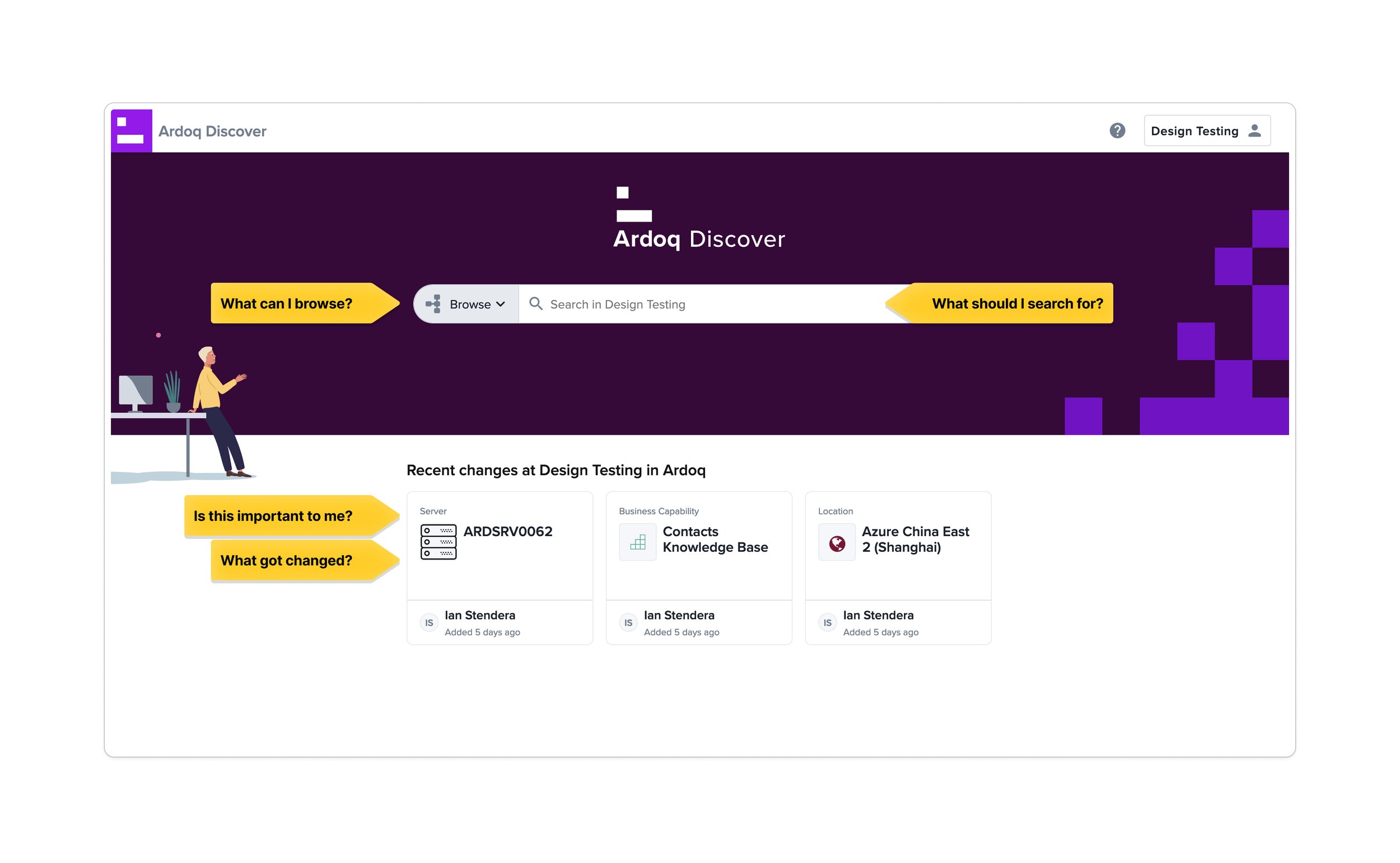
When I clicked Browse, a modal opened showing categories — much like a folder system with subfolders. For example, think of vacation photos sorted by year, then location, then date. I explored the Business Capabilities category.

I decided to explore the Business Capabilities category.

When I clicked Open it took me to a new Details page. But when I used the browser’s Back button, I was sent all the way back to the landing page instead of returning to the modal — forcing me to restart navigation.

Thinking of improvements and solutions
I began by creating a simple customer journey of how the user reaches the landing page of Ardoq Discover.
By the time a user purchases Ardoq Discover, Ardoq is already well-informed about their level of expertise, wants/needs, company size, company type, etc.
This information can be used to personalize the experience: support docs, tutorial videos, and a basic setup-guide could be surfaced.

I sketched ideas focusing on layout, spacing, and grid structure, then moved into Figma for higher-fidelity exploration.

Iterations
The Updated (“Recent Changes”) section now shows more detail: longer titles and brief notes.
Search suggestions appear for new users; admins can add suggestions (e.g., when a new user is added).
Support documentation is easier to access, and items can be “pinned” like bookmarks.

Iteration 1
I tried an alternate layout but found it unsatisfactory since it still hid the Browse feature. I wanted categories visible immediately so users know where they can go.

Iteration 2
In the refined design, categories are displayed clearly in the left-panel, with scrollable lists if necessary. Suggestions, relevant information, updates, and recents are clearly on display in the main window.
Exposing the taxonomy reduces cognitive load, helps non-specialists see possible entry points, and lets experts quickly scan for the right domain.

Iteration 2
In my design below, I introduced distinct approaches for searching.
A global search at top for system-wide queries.
A contextual search inside each category to scope results when users want focused results.
This gives users more relevant results depending on whether they are browsing or searching broadly.
On the left side, the parent category (e.g. “Business Capabilities”) is visible, with its children shown in a drop-down. Clicking into subcategories reveals further options; breadcrumbs help maintain orientation. All primary subcategory titles remain visible so users can assess at a glance if they’re in the right place, without excessive scrolling.

I also observed a limitation: when there are many levels of subcategories
Business Capabilities → Contact Center → Contact Center Design → Contact Center Setup
I tried to highlight the hierarchy by reducing the font size of each child. However, if there are more subcategories, showing all of them in full detail by reducing the text size becomes impractical.
So I explored showing only main subcategory levels by default, with a “Load More” or “Go to subcategories” option for deeper navigation.
Iteration 3
Displaying a load more option

Iteration 4
Loading subcategories in a side panel.

Iteration 5
I also explored the idea of integrating ChatGPT, which had become incredibly popular by June 2023. I envisioned a design where users could simply ask for the Details page they need. For instance, if someone wanted to see office locations in EMEA, that information might exist under categories of “Locations” or “People and Organizations.” Instead of manually searching through categories, users could just type a natural language query and be taken directly to the relevant Details page.


Proposal
Ardoq liked the idea of making categories immediately visible rather than hidden in a menu. My design supports both new and advanced users by doing just that: showing categories clearly at first glance. Also:
The search bar remains prominent at the top so users who prefer search can access it immediately.
They liked the idea of Admins gaining the ability to customize the home page: they can pin or share important items and display relevant content for their team.
A navigation panel on the right helps users confirm they’re in the correct section, reducing the need to scroll excessively.
Subcategories load in a dedicated tab to reduce clutter in the main navigation.
Conclusion
Although this project was not implemented or user-tested it was presented to Ardoq. It was a valuable learning experience that allowed me to strengthen my UX design process. From analyzing existing user flows and identifying pain points to exploring multiple design directions and iterating on solutions, I was able to practice end-to-end design thinking. The case study reinforced the importance of balancing clarity for new users with efficiency for experts, and it gave me practical experience in structuring navigation, improving discoverability, and considering personalization. Overall, it helped me grow as a UX designer and prepared me to tackle similar real-world challenges in the future.