Gramo
Redesigning the Echo Admin Tool
Role: Lead UX Designer
Gramo is Norwegian organization that manages the rights of artists, musicians, and record labels. It collects payments for the public use of recorded music, such as on the radio, in stores, cafes, and gyms. It then distributes these payments to its members, who include over 52,000 artists and rights holders.
When I joined Gramo, I was asked to redesign Echo, the internal tool used to identify music played in public venues and distribute royalties fairly to rights holders, artists, and record labels.
At first glance, Echo seemed functional. But once I shadowed administrators — the people who spent their entire workday inside the tool — I saw the cracks.
Simple tasks like identifying a track took far too many steps. Admins bounced between Echo, Spotify, Discogs, and other external databases just to cross-check information such as:
Spelling variations
Misattributed artists
Translated titles
Incorrect ISRC codes
Newly released tracks not yet in the database
Obscure or rare songs
Worse, if a track appeared on multiple radio stations, they had to verify it multiple times, repeating the same work over and over. The interface itself didn’t help: important fields were buried, layouts were inconsistent, and dense tables slowed down scanning.
The system worked — but not for the people behind it.
My Process
1. Observing and Listening
I started by sitting with administrators during their daily routines. I mapped their workflows, listened to their frustrations, and documented every workaround they had developed to cope with Echo’s inefficiencies.
From this, I surfaced the core friction points:
Redundant verification steps.
Excessive manual data entry.
UI layouts that buried important fields.
Visual clutter that made scanning slow and tiring.
Samples of some notes from work flows that I observed


2. Defining the Core Problems Through Jobs to Be Done
To make sense of what I observed, I reframed the admins’ pain points as Jobs to Be Done (JTBD) — what they were really trying to accomplish, beyond just “using the tool.”
Jobs to Be Done
When I receive a list of unidentified tracks,
I want to quickly verify them against trusted sources,
so I can finish my work without spending hours jumping between tools.
Before: Admins copied details into Echo from Spotify, Discogs, and VRDB manually.
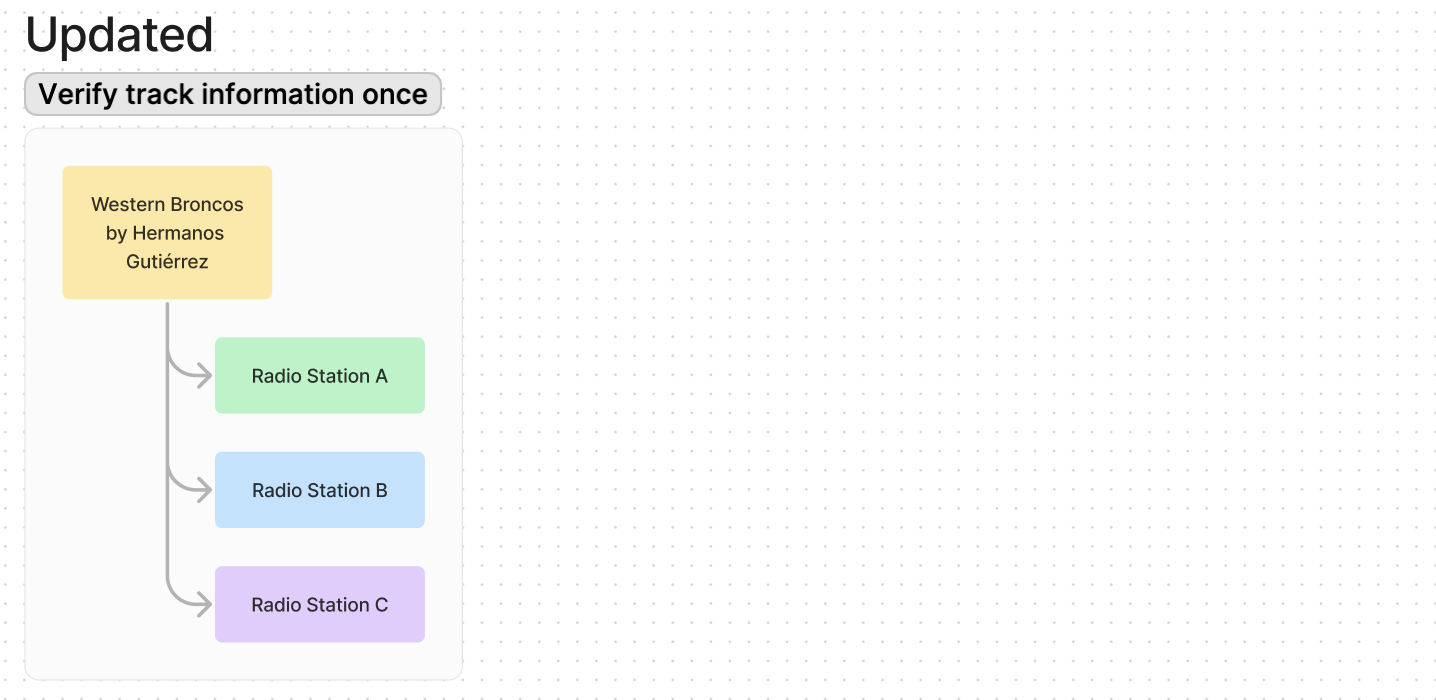
When I identify a track once,
I want that information to apply across all radio stations,
so I don’t waste time doing the same work multiple times for multiple radio stations.
Before: Echo treated each station separately, forcing duplicate verification.
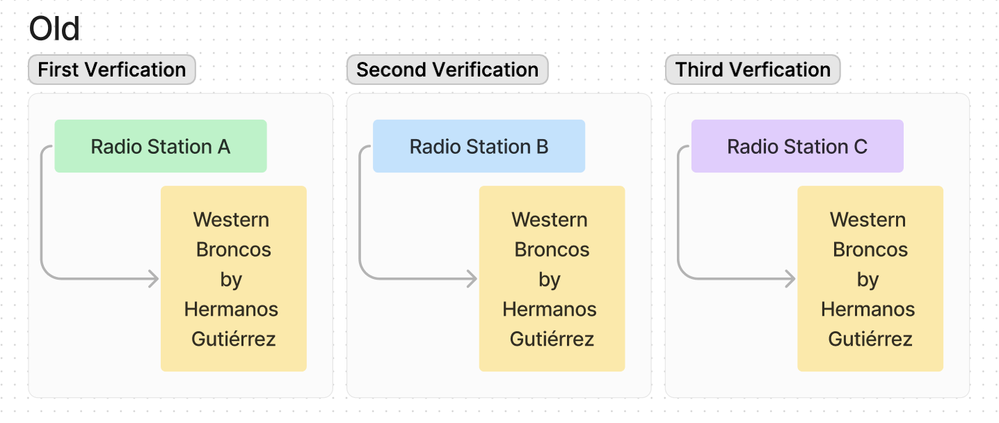
Visual model of how an admin would have to verify the same track three times for different radio stations
When I’m entering or reviewing track metadata,
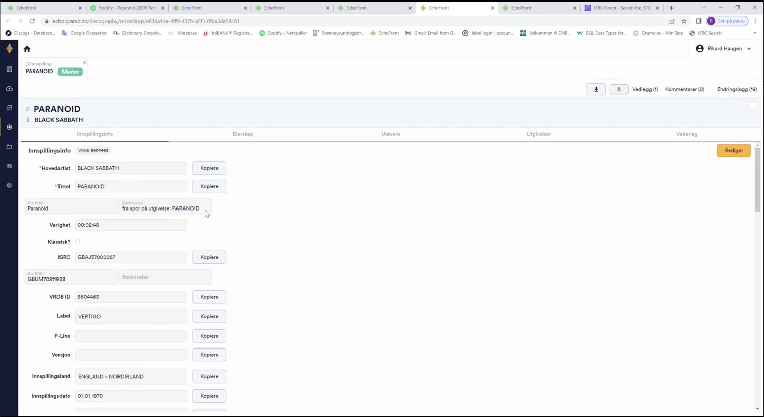
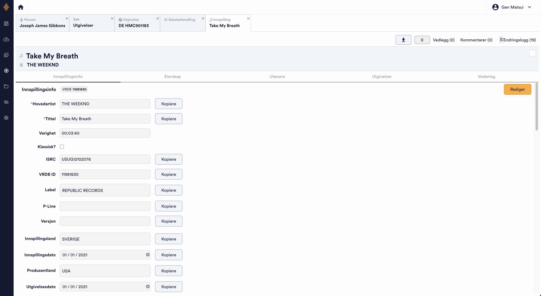
I want the most important fields (like ISRC) to be easy to find,
so I can avoid errors and work faster.
Before: ISRC was buried in the layout, requiring constant scrolling.
When I need track details like label, release date, or P-line,
I want them imported automatically,
so I don’t have to gather them from multiple sources.
Before: Admins did repetitive copy-paste tasks across several databases.
These statements became the north star for my design decisions.
3. Designing Smarter Workflows
Armed with the JTBD, I set out to redesign Echo so that it supported — instead of hindered — the admins’ goals.
Restructuring the data model
I changed the relationship between tracks and radio stations. Tracks became the parent entity, with stations as child tags. This meant that once a track was identified, that verification applied everywhere — no more duplicate work.
Automating data imports
I expanded Echo’s integration with the Spotify API. Instead of pulling only artist, title and duration from ISRC, Echo now imported label, release date, genre, country, and P-line/C-line automatically. Manual copy-paste of these information became the exception rather than the rule.
Below is a tree I created showing relationship of data to ISRC:
✅ Indicates information that was automatically imported previously
⭐️ Indicates information that is automatically imported with update
🛑 Indicates information that must always be manually entered because API is not available
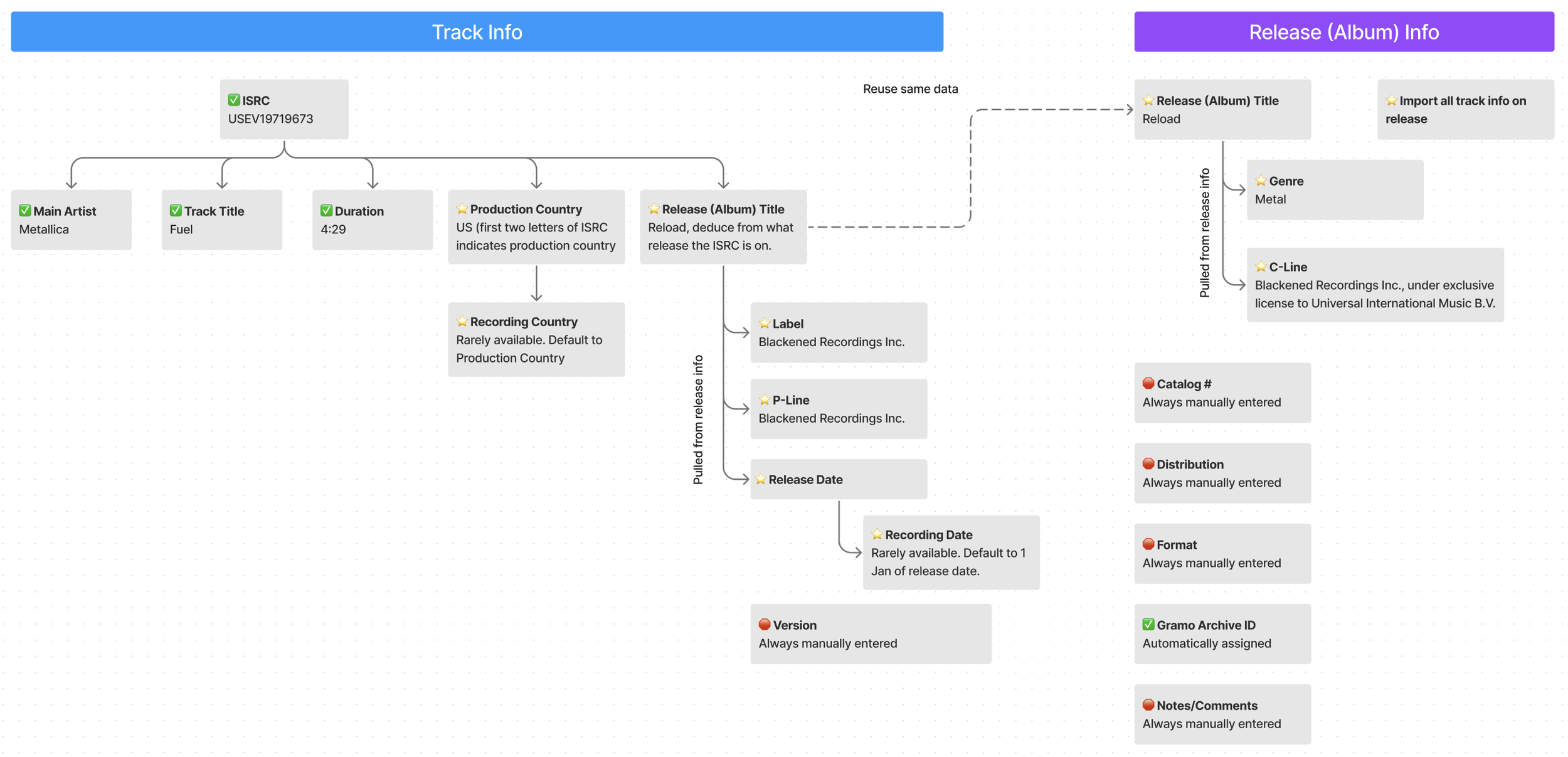
Tree showing relationship of data to ISRC.
Cleaning up the interface
I reorganized form layouts so the most critical fields (like ISRC) appeared first, aligned components for consistency, and reduced clutter by only showing underlines on hover.
4. Streamlining with IBM Carbon: Efficient Design for Fast Turnaround
I chose IBM Carbon Design System for this project because it offers a highly consistent and user-friendly interface, making it ideal for data-heavy administrative tasks like financial analysis and reporting.
With a small team of two developers and a client requiring a fast turnaround, Carbon's pre-built components, including customizable tables, grids, and data visualizations, provided an efficient way to quickly implement key features without needing to build from scratch. Its open-source nature and extensive documentation also supported our rapid progress. Overall, IBM Carbon streamlined workflows, improved productivity, and enabled a smooth, fast design and development process
The Results
Verify once, apply everywhere: Tracks were now the parent entity, eliminating redundant work across stations.
Automated metadata import: Spotify API integration drastically reduced manual entry.
Prioritized layouts for speed: ISRC and other key fields surfaced first for quicker access.
Fast, confident workflows: Cleaner tables, improved hierarchy, and better typography reduced scanning time.
One-click efficiency: Hover-to-copy buttons cut small but constant interruptions.
🔁 100% less duplicate work for verifying the same track — restructuring tracks as parent entities eliminated repetitive verification across stations.
🤖100% auto-fill of metadata for 11 data points.
🤖100% reduction in time to copy paste these 11 data points from around 60-70 seconds to 0 seconds.
🤖 100% automated role code translation (e.g., “A” → “MS/NF”), saving ~6 seconds per track by removing the need to manually match the two fields (Rollekode and Rolle).
✅ 100% fewer errors thanks to automation of meta data import and role code translation.
💪 5 out of 5 admins reported higher confidence in their work after the redesign.
📈 About 6 hours saved per admin per week — cumulative time savings from automation and reduced duplication.
🎶 15% more tracks processed weekly — from around an average of 500 tracks per week per admin to 575 tracks.
Reflection
This project reinforced a principle I carry into every design: internal tools deserve as much care as user-facing products.
By reframing pain points into Jobs to Be Done, I was able to align the redesign with what users actually needed to accomplish. Pairing that with close collaboration, technical improvements, I turned Echo from a source of frustration into a tool that empowered its admins. I ultimately made royalty distribution faster and fairer for the artists who depend on it.
Echo designs BEFORE
Echo Designs AFTER
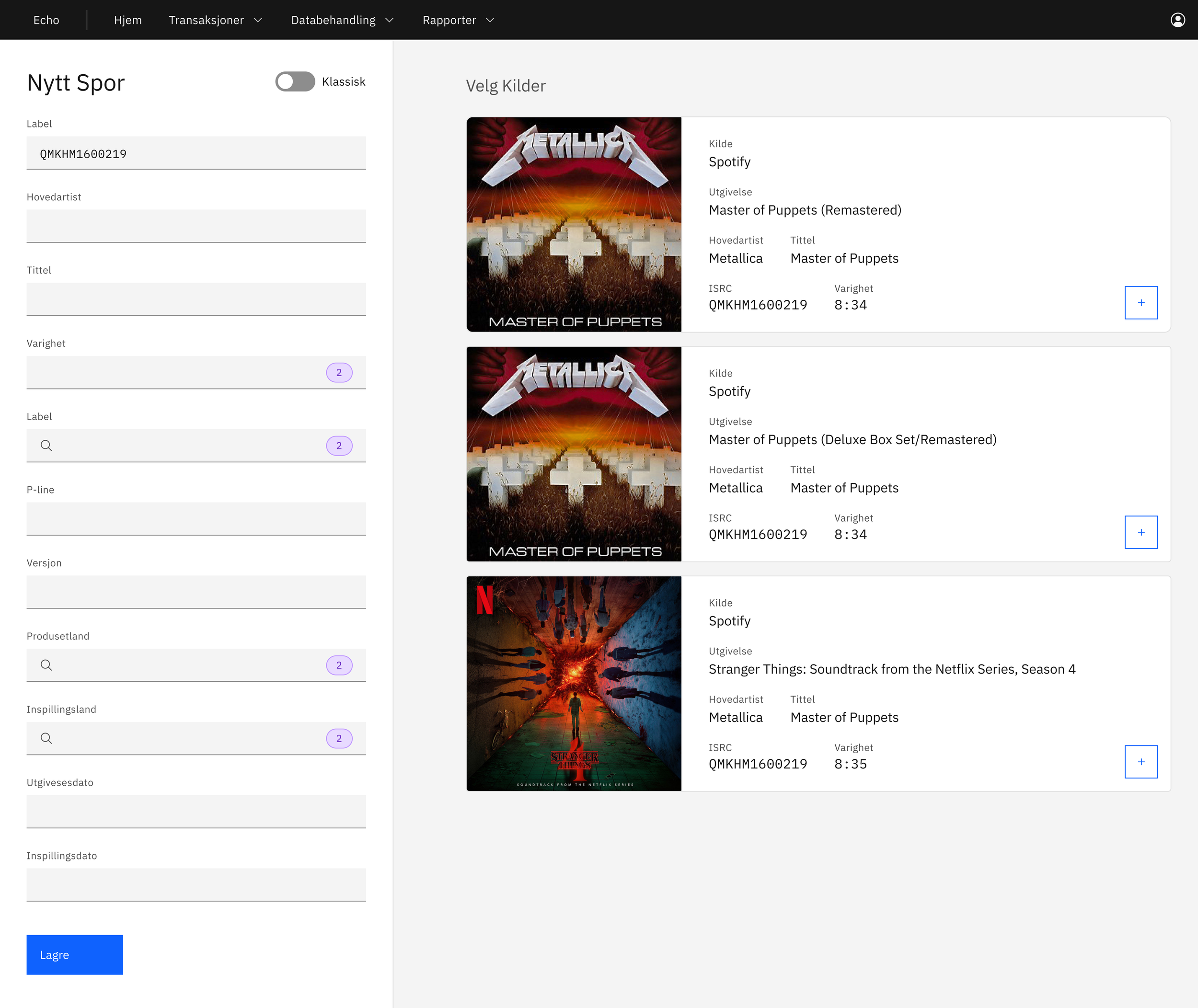
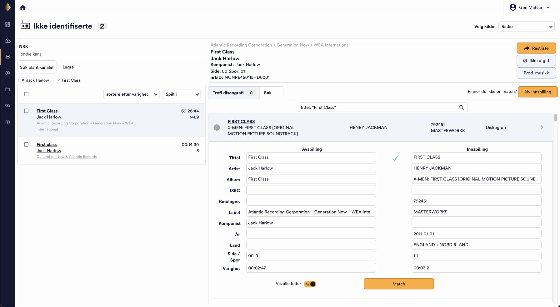
The main screen for “Unidentified Tracks” features two panels: a list of unidentified tracks on the left, and detailed information about the selected track on the right. This setup allowed them to browse related data on the left while keeping the active track open on the right.

During observation sessions, I noticed that admins frequently copied ISRCs, catalog numbers, and nrkIDs to cross-reference with external sources—an essential but unautomatable step. To streamline this process, I added a hover-triggered copy button, removing the need to highlight text manually.
When adding a new track, users can now search by ISRC and import suggested data from Spotify. Previously, all details had to be entered manually. Key information—album cover, title, ISRC, artist, track name, and duration—are now displayed for easier comparison. Once a source is selected, all relevant data is automatically imported.
In the left panel, the purple badges indicate the number of data variations for each field. For example, "duration" shows 2 results if one source lists the track as 8:34 and another as 8:35. Users can click the squares to choose preferred values from different sources.