Protector Payment Tracking Dashboard
Role: Senior UX Designer
Industry: Insurance
Focus: Data Visualization, Dashboard Design, Business Strategy
This case study shows my ability to take initiative: I discovered the problem, proposed the idea, designed the solution, and connected it directly to business outcomes.
Protector Forsikring (“Forsikring” meaning insurance in Norwegian) is an insurance company headquartered in Oslo, Norway. They are known for being a specialist insurer that focuses on commercial lines of business. They offer insurance products to businesses and organizations, rather than individual consumers. They operate and have offices across Denmark, Finland, France, Norway, Sweden, and the UK.
How I Discovered the Problem
In my role as a Senior UX Designer, I regularly spoke with stakeholders across finance and account management. A recurring theme emerged:
Customers often forgot to pay invoices on time.
Protector failed to credit payments promptly.
There was no centralized way to get an overview of overdue or incoming payments.
This created a cycle of cash flow uncertainty, strained broker relationships, and heavy administrative workload.
At this point, I realized Protector didn’t just need a better process — it needed a dedicated system to track, analyze, and act on payment data.
My Idea
Seeing this gap, I proposed the idea of creating a Payment Tracking Dashboard.
My vision: a single, intuitive interface where Protector could monitor overdue invoices, understand payment trends, and strengthen broker and customer relationships through data-driven conversations.
This was not a project handed to me — it was a solution I initiated, rooted in my understanding of both user pain points and business risks.
Designing the Solution
I then moved from idea to execution, designing a dashboard that balanced at-a-glance insights with deep-dive analysis.
The dashboard included:
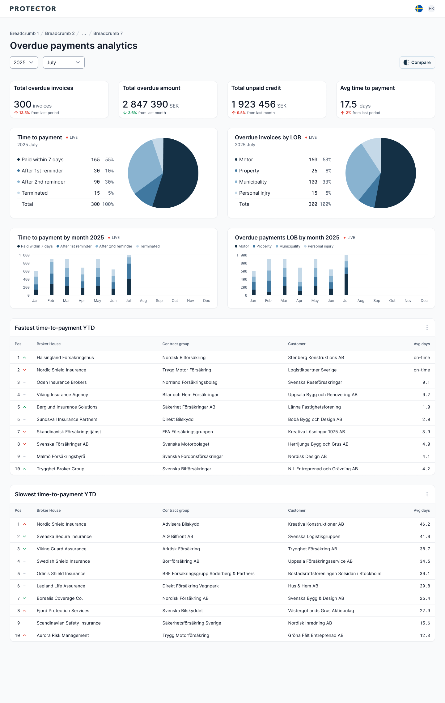
1) Financial Overview (KPIs)
Total overdue invoices
Total overdue amount
Total unpaid credit
Average time to payment
2) Category Trends
Breakdown of overdue invoices by insurance category (Motor, Property, Municipality, Personal Injury)
Breakdown of overdue invoices by time-to-payment
3) Monthly Trends
Overview by month of overdue invoices by insurance category (Motor, Property, Municipality, Personal Injury)
Overview by month of overdue invoices and time-to-payment
4) Client Insights
Top 10 fastest paying clients
Top 10 slowest paying clients
5) Broker-to-Broker Comparison
A feature I introduced to benchmark two brokers side by side.
This allows leadership to identify strong performers, address risks, and design fair incentives.
Information below is dummy data. It does not reflect real brokers.
Why These Metrics Matter
Every data point served a specific purpose:
KPI cards → give leadership a quick financial pulse.
Category breakdowns → identify systemic product-level issues.
Monthly trends → surface patterns and seasonal fluctuations.
Client lists → give account managers actionable outreach priorities.
Broker comparison → supports strategic growth and strengthens broker accountability.
This structure made the dashboard useful not just for analysts, but also for executives and account managers.

Business Impact
By driving this initiative from concept to design, I delivered a tool that:
Increased operational efficiency by reducing manual reconciliation.
Improved cash flow predictability through real-time monitoring.
Strengthened broker and customer relationships with transparent, data-backed conversations.
Informed strategic growth by highlighting high-performing brokers and risky partnerships.
Outcome
It empowered team managers and account managers with quick overviews, trend insights, and clear next steps. Most importantly, it demonstrated how I can go beyond interfaces — identifying problems, proposing solutions, and implementing ideas that directly impact the business.