RIVIAN
Rivian is an American electric vehicle (EV) manufacturer and automotive technology company, founded in 2009. Rivian specializes in all-electric SUVs and pickup trucks, which are sold in the U.S.
I was hired as a freelance UI UX designer to lead the design of the user interface for the vehicle, driver, and home insurance purchasing flows across desktop, tablet, and mobile platforms. These flows are used by anyone purchasing a Rivian vehicle, meaning my work directly impacts the customer experience during the purchase process.

Image by Rivian

Image by Rivian
My Key Contributions:
Legal Compliance: In the U.S., the insurance purchasing process varies by state and is subject to numerous legal requirements. I worked closely with legal teams on a daily basis to ensure that every part of the flow — from layout to language — was compliant. This included reviewing and iterating on copy, imagery, and interaction design to meet strict regulatory standards.
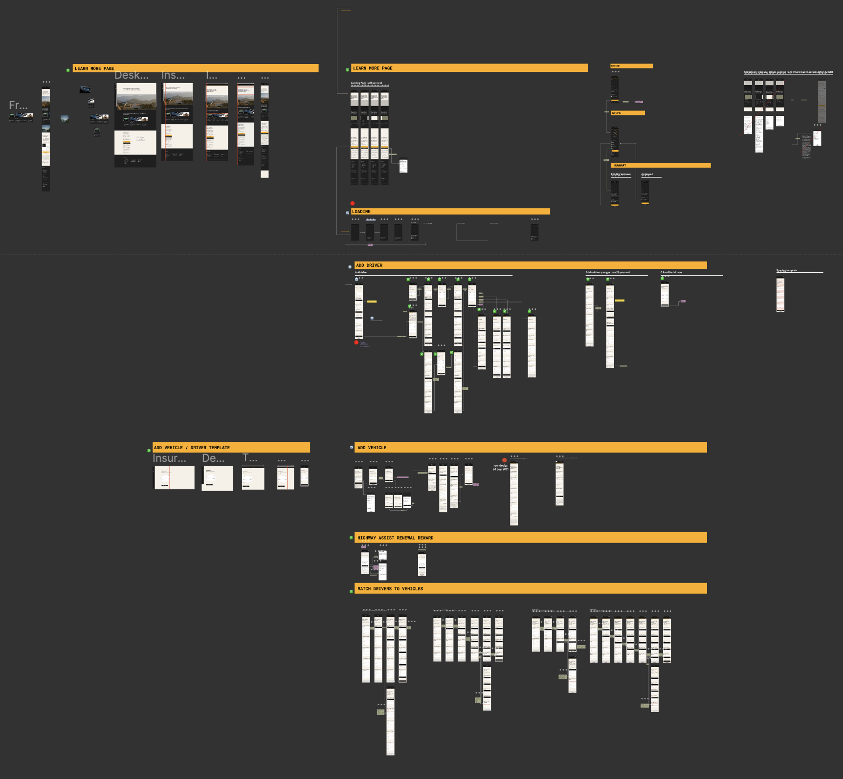
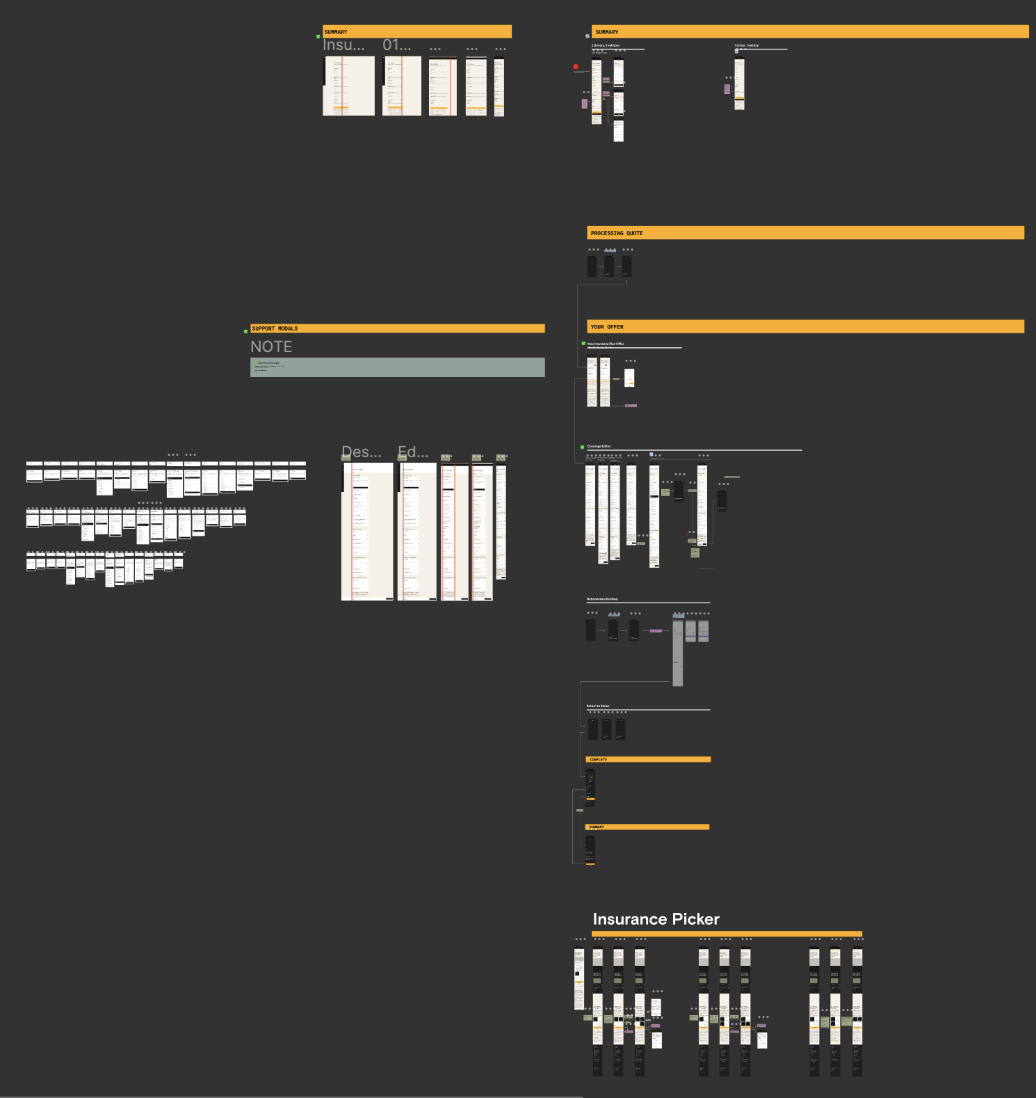
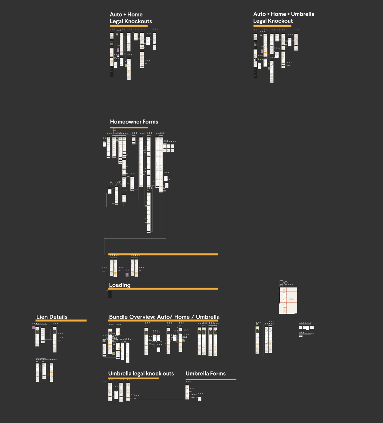
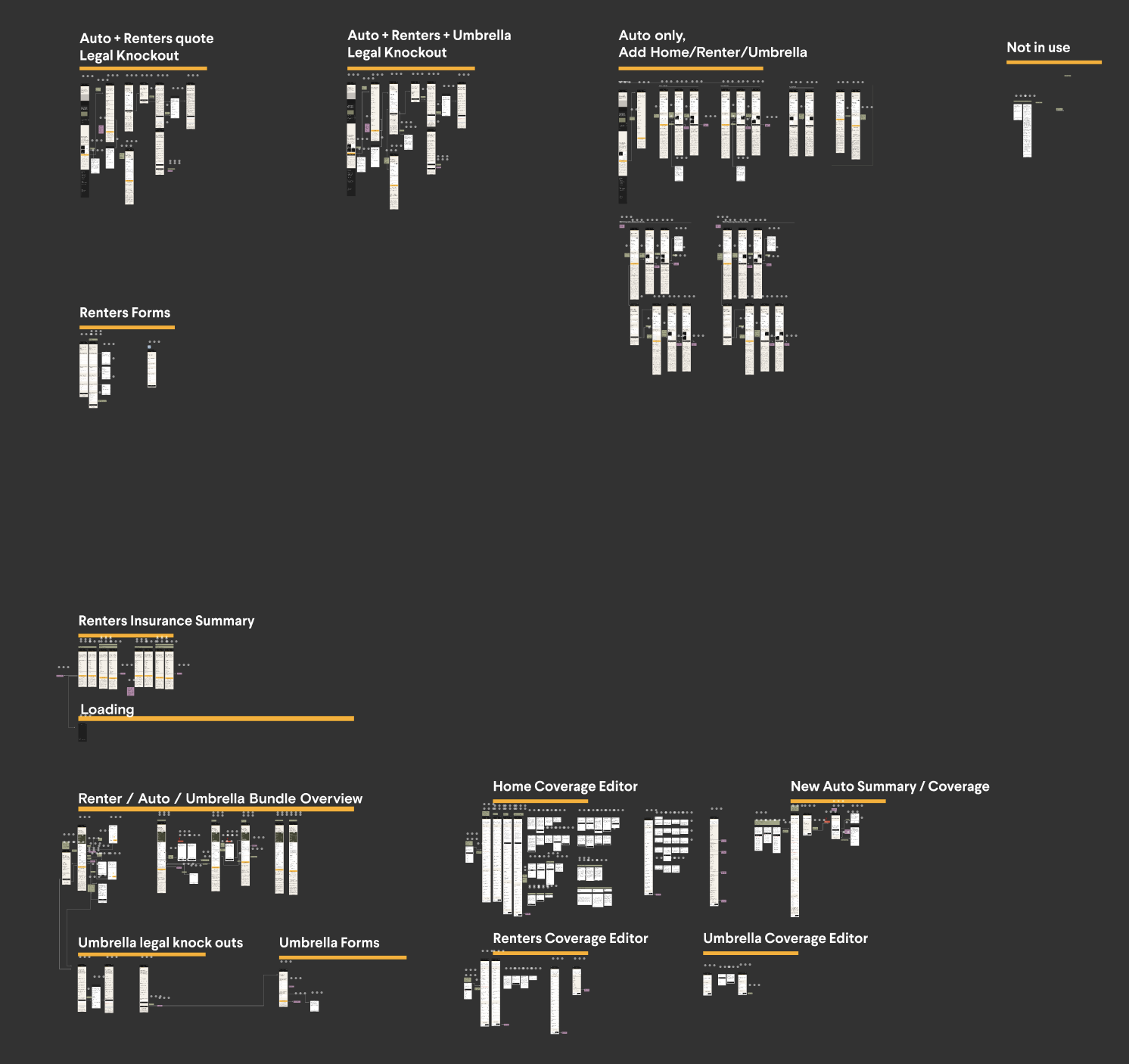
In particular, I partnered with Rivian’s legal team to map out and design for all possible combinations of permitted or prohibited insurance scenarios across the US and Texas, Utah, Illinois, and California — each with its own specific regulations and edge cases. This involved identifying legal distinctions by state, such as coverage requirements, policy structure, and required user confirmations, and reflecting them clearly in the UI.
If a design did not meet legal approval, I was responsible for making the necessary revisions. This often included:
Adjusting copy to avoid misleading or non-compliant language
Modifying imagery that could imply incorrect coverage or promises
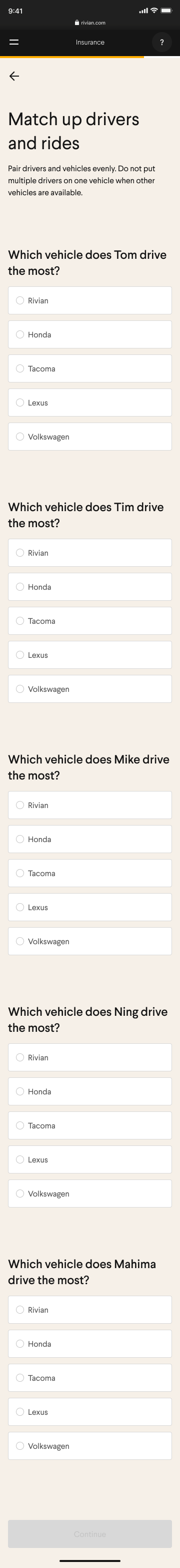
Incorporating complex, state-specific logic into user flows (e.g. driver-to-vehicle matching)
Example Scenarios:
If the number of drivers equaled the number of vehicles, each had to be explicitly matched 1:1.
If there were more drivers than vehicles, each driver still had to select the vehicle they primarily drove.
If there were more vehicles than drivers, excess vehicles could be assigned arbitrarily — but the UI had to handle and display this correctly.
Even in simple cases (e.g., one driver and one vehicle), legal compliance required that the driver explicitly confirm the vehicle assignment.
When auto-assigning vehicles (e.g., if John selects the Toyota, Jane is automatically assigned the Subaru), the system still had to display and confirm this for legal documentation.
UI Design and Brand Alignment: Rivian partnered with Nationwide to offer auto, personal, and home insurance options. However, Nationwide's existing design didn't align with Rivian’s modern, minimalist brand identity. I was tasked with updating Nationwide’s designs to match Rivian’s style guide, writing guide, and design system, ensuring a seamless and cohesive experience for customers.
Creating Custom UI Components: While most of Rivian’s existing design system was applicable to the insurance purchasing flows, I designed news components tailored specifically to the insurance experience. This included addressing unique challenges presented by the multi-step insurance purchasing process.
Cross-Platform Design: I ensured a seamless user experience across desktop, tablet, and mobile devices, designing with responsiveness and consistency in mind. This allowed users to complete their insurance purchase easily, regardless of the device they were using.
These nuanced requirements made legal collaboration a core part of the design process, and I was solely responsible for ensuring that the final user experience was both legally sound and user-friendly. Once approved by legal, my designs were reviewed by the design manager to ensure consistency with Rivian’s brand and product standards before implementation.
Nationwide original design


After - Rivian Mobile First Design Samples
Animation of my designs for Rivian on mobile.
UI/UX Contributions
In addition to broader design responsibilities, I contributed several detailed UI and UX enhancements to improve clarity, usability, and legal compliance within the insurance purchasing flow:
Optimizing User Flow to Reduce Friction
One of my key UX contributions involved restructuring the insurance questionnaire flow to minimize user frustration and reduce unnecessary form completion. Working closely with Rivian’s legal team, I helped identify specific customer scenarios that legally required users to speak directly with Rivian Insurance Support or Nationwide, rather than complete their application online. These scenarios often depended on factors like coverage type, residency status, or policy complexity. To address this, I redesigned the flow to surface disqualifying questions earlier in the process. This allowed us to:Identify ineligible users sooner
Redirect them to the appropriate support channel
Prevent them from wasting time filling out lengthy forms they couldn’t complete online
These changes improved both the efficiency of the purchasing flow and the overall user experience, particularly for edge-case customers. It also reduced frustration and support escalations by setting clear expectations from the start.
Improved Toggle Clarity
I identified confusion in the toggle component where the "on" state appeared gray — a color typically associated with "disabled" elements. I proposed and implemented a change to black for the active state, aligning with user expectations and increasing clarity.Modal for Mobile Calendar
I tailored the desktop calendar modal for mobile design.Expandable Policy Coverage Tiles
I designed expandable/collapsible tiles for displaying policy-level coverage options. This approach helped manage complexity and reduce visual clutter while allowing users to explore details as needed. These tiles were later adopted into Rivian’s core component library as reusable UI elements.Summary Page Fonts
I created the summary page for the insurance flow, which included a detailed overview of selected coverages, drivers, and vehicles. To improve readability and hierarchy, I recommended and implemented custom font sizes that better fit the content and layout—bridging a gap in Rivian’s existing design system.Design of Insurance Purchasing Flow
I designed all of the vehicle registration and insurance purchasing screens to match Rivian’s style guide, writing guide, and design system, ensuring a seamless and cohesive experience for customersStrategic Placement of Legal Copy
I worked closely with legal teams to determine where and how to present legally required text. My focus was on maintaining compliance without overwhelming the user. I developed solutions for integrating legal copy in a way that preserved the overall flow and readability, such as using collapsible sections or positioning copy contextually rather than as disruptive blocks of text.
Samples of mobile designs


Other Screens
Below are selected screenshots from the insurance purchasing flow I designed. While I can’t show every screen in full detail, these examples highlight the scale, complexity, and depth of the user experience I created.